JL
Work
About
Hired to Solve One Thing. Found Another.
Design Lead responsible for the full front end systemization initiative and IA redesign — working directly with an intermediate designer and executive leadership.
Role
Lead Product Designer
Project
White Label System & IA Redesign
Company
Brim Financial
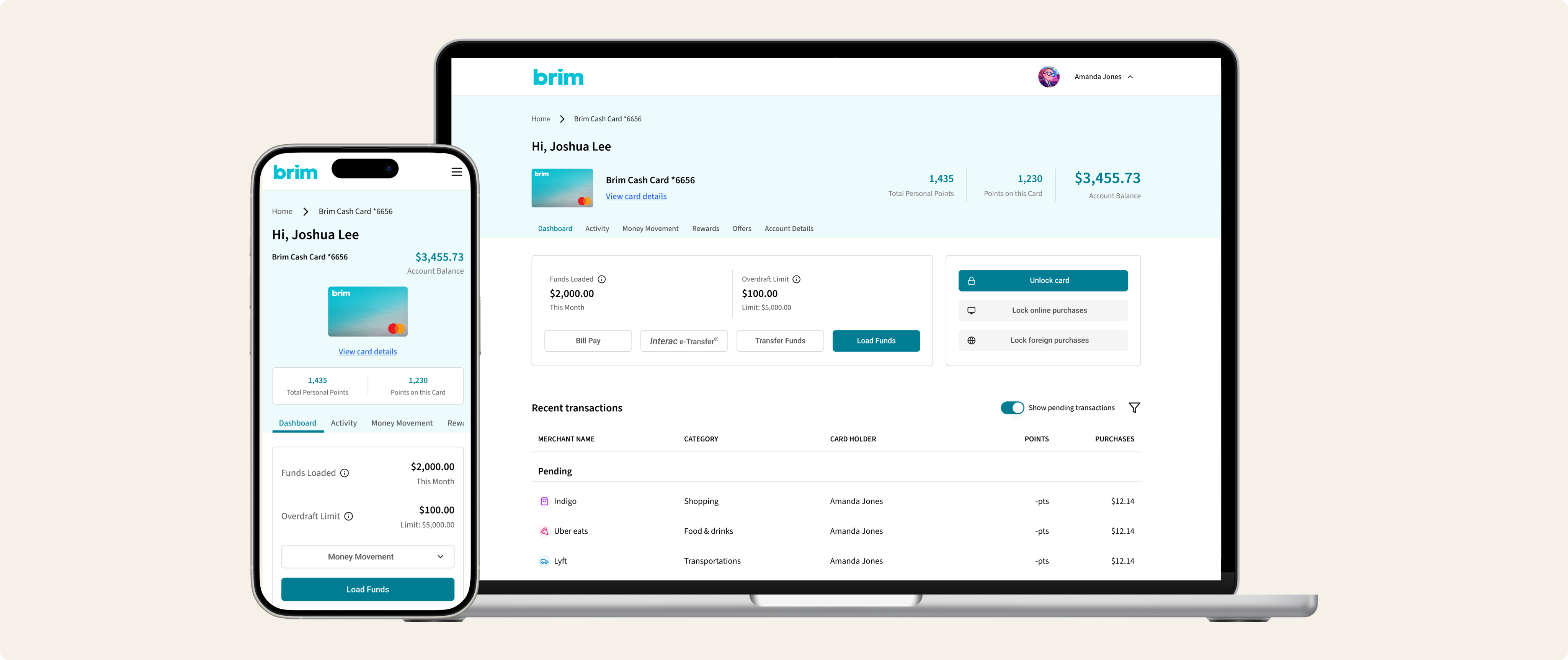
Why I was hired
I joined Brim Financial with a specific mandate — white label the platform.
Brim was moving toward a model where clients would control the look, feel, and functionality of the product. That meant the platform needed to be configurable at a fundamental level — not just skinnable with a different logo and color scheme, but architecturally flexible enough to show or hide entire product lines depending on what a client had enabled.
A client with a rewards product would see one experience. A client without rewards would see a different one. A client with balance transfer enabled would need that reflected consistently across the platform. A client without it wouldn't see it at all.
To make that work, the front end needed to be systemized from the ground up — components rebuilt with variables and tokens, responsive behavior defined for text and layout, and a clear logic for how the interface would adapt to different configurations across different languages and copy lengths.
That was the brief I was hired to solve. What I discovered along the way changed the scope of the work entirely.
What the white label work revealed
To systemize the front end properly, I had to understand it deeply — how components were built, how they related to each other, how the platform was structured at an architectural level.
That depth of context is what allowed me to see a problem nobody else had named yet.
When new product lines appeared on the roadmap, I recognized immediately that the existing information architecture couldn't support them. The platform had been designed around a single product — the Brim Credit Card. The navigation lived in the header. Controls and actions were organized around one product type. The visual hierarchy assumed one account, one card, one set of features.
Add a second product and the entire structure breaks. Navigation loses its context — users can't tell which product it relates to. Controls surface incorrectly for the wrong product type. The interface has no way to communicate which product the user is currently looking at.
This wasn't a future risk. It was a present problem waiting to be triggered the moment the first new product shipped.
Making the case
I brought this to the CEO — not as a design problem but as a product risk with a timeline.
Every feature built on the existing IA before addressing this would compound the problem. Every new product added without solving the navigation context issue would deepen user confusion. And critically — the white label work I'd already been mandated to do created the perfect opportunity to address both problems simultaneously. The foundation needed to be rebuilt anyway. We could build it right.
The CEO approved the direction and we moved into active development.
Fix the foundation before you build on top of it
Systematizing the front end
I took existing components and rebuilt them with variables and tokens — defining how elements would respond to different client configurations, how text would behave responsively, and how components would handle different languages and copy lengths.
The goal was a front end that could be configured rather than customized. A client enabling rewards would trigger a set of components designed to surface that product's specific controls and information. A client without rewards would see a clean experience with no trace of unused functionality.
Before this system existed, producing a rebranded and configured set of screens for a new client — the source of truth that both development and QA worked from — took design six weeks per client.
After the system was in place, that same process took two days.
95% reduction in client configuration turnaround — from 6 weeks to 2 days
Redefining the IA
Moving navigation from the header to the product level was the foundational decision. Rather than global navigation that floated above products without context, navigation became anchored to the product the user was currently viewing.
Separating product switching from product navigation gave users a clear mental model — you select a product, then you navigate within it. Two distinct actions, two distinct UI patterns.
Rather than attempting to redesign the entire platform at once, we sequenced the work deliberately. The prepaid product was the first to be built on the new IA — establishing the pattern, testing the navigation model, and proving the approach before rolling it out across existing products.
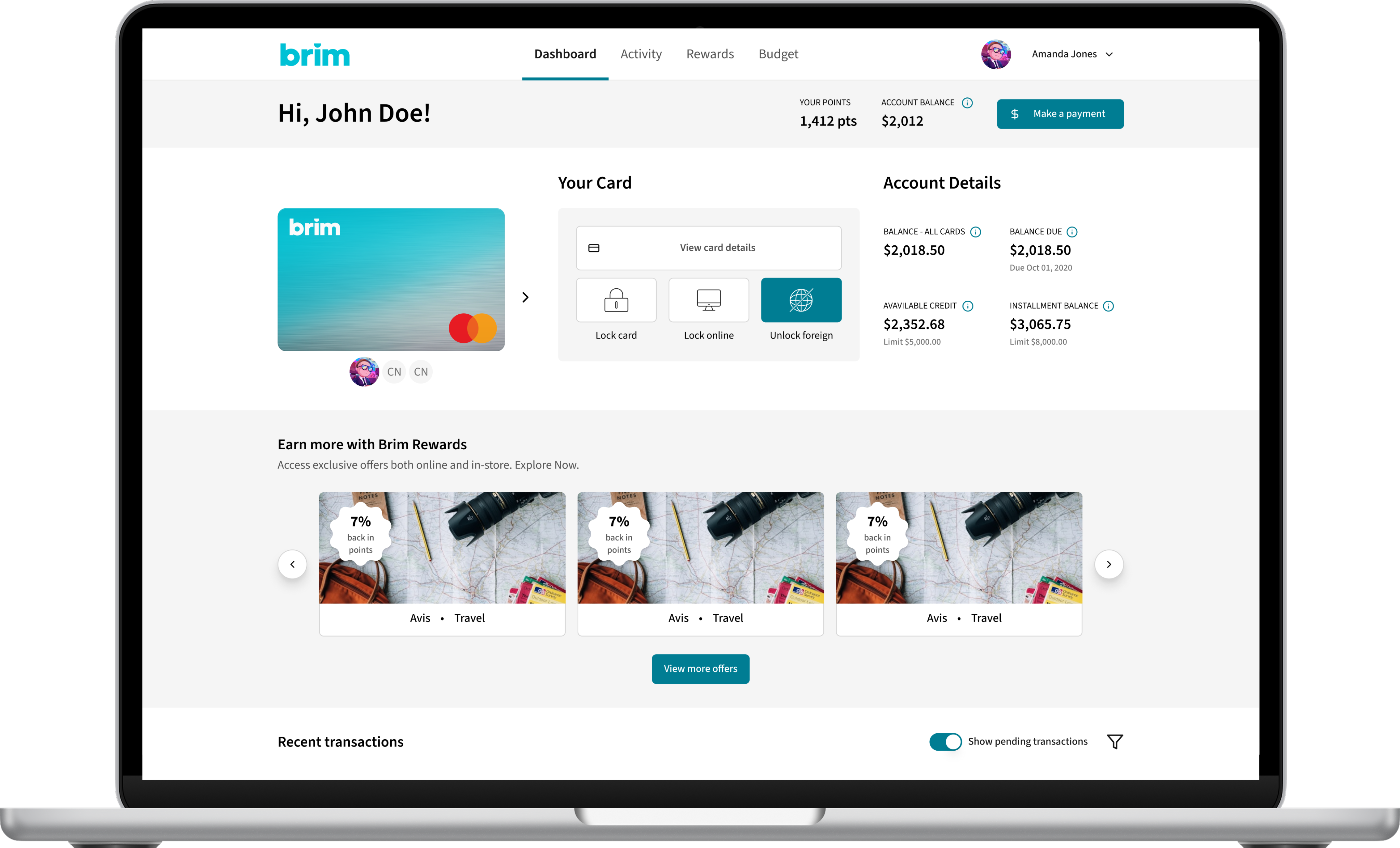
Old IA with single product dashboard with header navigation
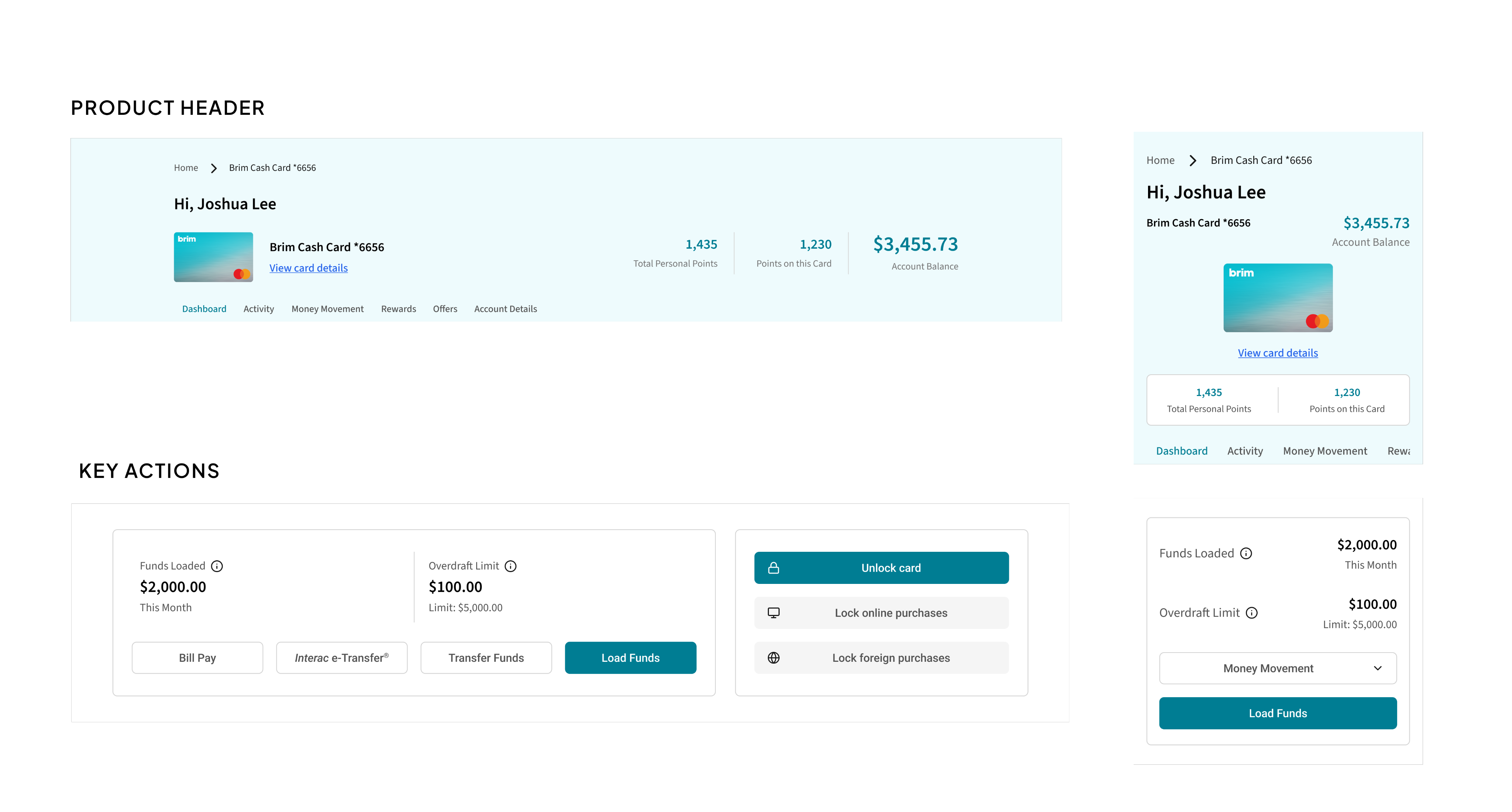
Multi-product architecture with product-anchored navigation
Leading the designer
This project was the first time the intermediate designer I was working with had worked with tokens and variables at this level of complexity. I set the overall strategy and design vision while she took on components to support our new prepaid product.
The token and variable system was new territory for her technically. We worked through it together — I'd define the approach and logic, she'd apply it, we'd review and refine. By the end she was handling new component work with increasing independence.
Watching someone go from unfamiliar with a concept to confidently applying it is one of the most rewarding parts of this work. This project was a good example of why.
Outcomes
6 weeks → 2 days Client configuration turnaround — 95% reductionCEO approved foundational redesign based on strategic observation made during white label work.
Prepaid product launched on new IA — first validated proof point of the new multi-product architecture.
Status
I transitioned out of Brim before the full rollout shipped, but the token system, front end systemization, and prepaid product IA were all in active development at the time of my departure. The client configuration process had already been transformed by the system work completed during my tenure.

Reflection
The most valuable thing about this project wasn't the system or the IA redesign — it was what the white label work taught me about the platform.
You can't make something configurable without understanding it deeply. And when you understand something deeply, you start to see the problems that aren't visible from the surface.
I was hired to solve one problem.
Understanding it properly revealed a second one. Making the case to solve both at once — before the roadmap made it urgent — is the kind of work I find most meaningful.

Joshua Lee
Work
About
Hired to Solve One Thing. Found Another.
Design Lead responsible for the full front end systemization initiative and IA redesign — working directly with an intermediate designer and executive leadership.
Role
Lead Product Designer
Project
White Label System & IA Redesign
Company
Brim Financial
Why I was hired
I joined Brim Financial with a specific mandate — white label the platform.
Brim was moving toward a model where clients would control the look, feel, and functionality of the product. That meant the platform needed to be configurable at a fundamental level — not just skinnable with a different logo and color scheme, but architecturally flexible enough to show or hide entire product lines depending on what a client had enabled.
A client with a rewards product would see one experience. A client without rewards would see a different one. A client with balance transfer enabled would need that reflected consistently across the platform. A client without it wouldn't see it at all.
To make that work, the front end needed to be systemized from the ground up — components rebuilt with variables and tokens, responsive behavior defined for text and layout, and a clear logic for how the interface would adapt to different configurations across different languages and copy lengths.
That was the brief I was hired to solve. What I discovered along the way changed the scope of the work entirely.
What the white label work revealed
To systemize the front end properly, I had to understand it deeply — how components were built, how they related to each other, how the platform was structured at an architectural level.
That depth of context is what allowed me to see a problem nobody else had named yet.
When new product lines appeared on the roadmap, I recognized immediately that the existing information architecture couldn't support them. The platform had been designed around a single product — the Brim Credit Card. The navigation lived in the header. Controls and actions were organized around one product type. The visual hierarchy assumed one account, one card, one set of features.
Add a second product and the entire structure breaks. Navigation loses its context — users can't tell which product it relates to. Controls surface incorrectly for the wrong product type. The interface has no way to communicate which product the user is currently looking at.
This wasn't a future risk. It was a present problem waiting to be triggered the moment the first new product shipped.
Making the case
I brought this to the CEO — not as a design problem but as a product risk with a timeline.
Every feature built on the existing IA before addressing this would compound the problem. Every new product added without solving the navigation context issue would deepen user confusion. And critically — the white label work I'd already been mandated to do created the perfect opportunity to address both problems simultaneously. The foundation needed to be rebuilt anyway. We could build it right.
The CEO approved the direction and we moved into active development.
Fix the foundation before you build on top of it
Systematizing the front end
I took existing components and rebuilt them with variables and tokens — defining how elements would respond to different client configurations, how text would behave responsively, and how components would handle different languages and copy lengths.
The goal was a front end that could be configured rather than customized. A client enabling rewards would trigger a set of components designed to surface that product's specific controls and information. A client without rewards would see a clean experience with no trace of unused functionality.
Before this system existed, producing a rebranded and configured set of screens for a new client — the source of truth that both development and QA worked from — took design six weeks per client.
After the system was in place, that same process took two days.
95% reduction in client configuration turnaround — from 6 weeks to 2 days
Redefining the IA
Moving navigation from the header to the product level was the foundational decision. Rather than global navigation that floated above products without context, navigation became anchored to the product the user was currently viewing.
Separating product switching from product navigation gave users a clear mental model — you select a product, then you navigate within it. Two distinct actions, two distinct UI patterns.
Rather than attempting to redesign the entire platform at once, we sequenced the work deliberately. The prepaid product was the first to be built on the new IA — establishing the pattern, testing the navigation model, and proving the approach before rolling it out across existing products.
Old IA with single product dashboard with header navigation
Multi-product architecture with product-anchored navigation
Leading the designer
This project was the first time the intermediate designer I was working with had worked with tokens and variables at this level of complexity. I set the overall strategy and design vision while she took on components to support our new prepaid product.
The token and variable system was new territory for her technically. We worked through it together — I'd define the approach and logic, she'd apply it, we'd review and refine. By the end she was handling new component work with increasing independence.
Watching someone go from unfamiliar with a concept to confidently applying it is one of the most rewarding parts of this work. This project was a good example of why.
Outcomes
6 weeks → 2 days Client configuration turnaround — 95% reductionCEO approved foundational redesign based on strategic observation made during white label work.
Prepaid product launched on new IA — first validated proof point of the new multi-product architecture.
Status
I transitioned out of Brim before the full rollout shipped, but the token system, front end systemization, and prepaid product IA were all in active development at the time of my departure. The client configuration process had already been transformed by the system work completed during my tenure.

Reflection
The most valuable thing about this project wasn't the system or the IA redesign — it was what the white label work taught me about the platform.
You can't make something configurable without understanding it deeply. And when you understand something deeply, you start to see the problems that aren't visible from the surface.
I was hired to solve one problem.
Understanding it properly revealed a second one. Making the case to solve both at once — before the roadmap made it urgent — is the kind of work I find most meaningful.

Joshua Lee
Work
About
Hired to Solve One Thing. Found Another.
Design Lead responsible for the full front end systemization initiative and IA redesign — working directly with an intermediate designer and executive leadership.
Role
Lead Product Designer
Project
White Label System & IA Redesign
Company
Brim Financial
Why I was hired
I joined Brim Financial with a specific mandate — white label the platform.
Brim was moving toward a model where clients would control the look, feel, and functionality of the product. That meant the platform needed to be configurable at a fundamental level — not just skinnable with a different logo and color scheme, but architecturally flexible enough to show or hide entire product lines depending on what a client had enabled.
A client with a rewards product would see one experience. A client without rewards would see a different one. A client with balance transfer enabled would need that reflected consistently across the platform. A client without it wouldn't see it at all.
To make that work, the front end needed to be systemized from the ground up — components rebuilt with variables and tokens, responsive behavior defined for text and layout, and a clear logic for how the interface would adapt to different configurations across different languages and copy lengths.
That was the brief I was hired to solve. What I discovered along the way changed the scope of the work entirely.
What the white label work revealed
To systemize the front end properly, I had to understand it deeply — how components were built, how they related to each other, how the platform was structured at an architectural level.
That depth of context is what allowed me to see a problem nobody else had named yet.
When new product lines appeared on the roadmap, I recognized immediately that the existing information architecture couldn't support them. The platform had been designed around a single product — the Brim Credit Card. The navigation lived in the header. Controls and actions were organized around one product type. The visual hierarchy assumed one account, one card, one set of features.
Add a second product and the entire structure breaks. Navigation loses its context — users can't tell which product it relates to. Controls surface incorrectly for the wrong product type. The interface has no way to communicate which product the user is currently looking at.
This wasn't a future risk. It was a present problem waiting to be triggered the moment the first new product shipped.
Making the case
I brought this to the CEO — not as a design problem but as a product risk with a timeline.
Every feature built on the existing IA before addressing this would compound the problem. Every new product added without solving the navigation context issue would deepen user confusion. And critically — the white label work I'd already been mandated to do created the perfect opportunity to address both problems simultaneously. The foundation needed to be rebuilt anyway. We could build it right.
The CEO approved the direction and we moved into active development.
Fix the foundation before you build on top of it
Systematizing the front end
I took existing components and rebuilt them with variables and tokens — defining how elements would respond to different client configurations, how text would behave responsively, and how components would handle different languages and copy lengths.
The goal was a front end that could be configured rather than customized. A client enabling rewards would trigger a set of components designed to surface that product's specific controls and information. A client without rewards would see a clean experience with no trace of unused functionality.
Before this system existed, producing a rebranded and configured set of screens for a new client — the source of truth that both development and QA worked from — took design six weeks per client.
After the system was in place, that same process took two days.
95% reduction in client configuration turnaround — from 6 weeks to 2 days
Redefining the IA
Moving navigation from the header to the product level was the foundational decision. Rather than global navigation that floated above products without context, navigation became anchored to the product the user was currently viewing.
Separating product switching from product navigation gave users a clear mental model — you select a product, then you navigate within it. Two distinct actions, two distinct UI patterns.
Rather than attempting to redesign the entire platform at once, we sequenced the work deliberately. The prepaid product was the first to be built on the new IA — establishing the pattern, testing the navigation model, and proving the approach before rolling it out across existing products.
Old IA with single product dashboard with header navigation
Multi-product architecture with product-anchored navigation
Leading the designer
This project was the first time the intermediate designer I was working with had worked with tokens and variables at this level of complexity. I set the overall strategy and design vision while she took on components to support our new prepaid product.
The token and variable system was new territory for her technically. We worked through it together — I'd define the approach and logic, she'd apply it, we'd review and refine. By the end she was handling new component work with increasing independence.
Watching someone go from unfamiliar with a concept to confidently applying it is one of the most rewarding parts of this work. This project was a good example of why.
Outcomes
6 weeks → 2 days Client configuration turnaround — 95% reductionCEO approved foundational redesign based on strategic observation made during white label work.
Prepaid product launched on new IA — first validated proof point of the new multi-product architecture.
Status
I transitioned out of Brim before the full rollout shipped, but the token system, front end systemization, and prepaid product IA were all in active development at the time of my departure. The client configuration process had already been transformed by the system work completed during my tenure.

Reflection
The most valuable thing about this project wasn't the system or the IA redesign — it was what the white label work taught me about the platform.
You can't make something configurable without understanding it deeply. And when you understand something deeply, you start to see the problems that aren't visible from the surface.
I was hired to solve one problem.
Understanding it properly revealed a second one. Making the case to solve both at once — before the roadmap made it urgent — is the kind of work I find most meaningful.
