JL
Work
About
Designing for the Firefight
Sole designer with full ownership across research, strategy, and design — from uncovering why the pilot failed through to a validated redesign.
Role
Lead Product Designer
Project
End to End Product Design
Company
Compass Digital
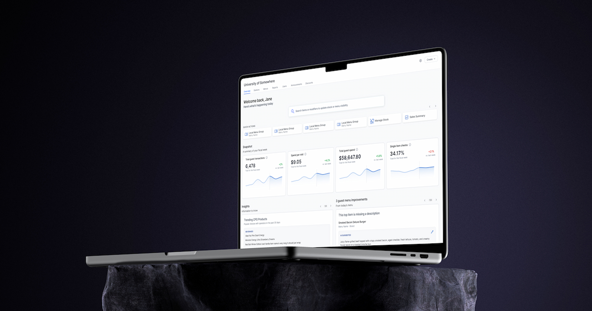
The situation
Compass Digital builds operator tools for the restaurant and hospitality industry. The product sits in the middle — taking menu data and surfacing it across multiple integrations to help operators run their sites.
The homepage was meant to be the front door. Leadership had defined the first set of functionality with the goal of promoting features across the platform. Product managers moved quickly to add what was easiest to implement.
Nobody validated whether any of it was what operators actually needed. When we piloted the homepage we found out.
The problem
Near zero interaction with almost everything on the page.
The homepage had been built on two assumptions — that operators would browse the platform to discover features, and that surfacing more functionality would drive more engagement. Both assumptions were wrong.
What we had built was a homepage designed for how we wished operators used the product. Not for how they actually did.
My role
I was the sole designer with full ownership of this project — from research through to the validated redesign. All user interviews, research synthesis, and data analysis were led by me.
One of the challenges I navigated throughout was a product culture where feature requests arrived as solutions rather than problems. Reframing the homepage around actual operator behavior required pushing back on that culture — and at one point making a case that traveled to VP level.
The decision to pause
After the pilot launched, I recruited operators who had participated — real users who had experienced the homepage in a live environment. What I heard was consistent: more questions than answers.
One question gave us our clearest signal. I asked pilot users how they would feel if we removed the homepage entirely.
Nobody fought for it. Absence of attachment is its own kind of data.
This wasn't a small decision. The homepage had high visibility across senior leadership. My PM took the insights and data I had surfaced to her director, who made the case upward to VP level. Leadership trusted the evidence enough to pause a high visibility release and give us ownership to redesign it properly.
What we learned
01
Operators don't browse. They firefight.
The one feature with any meaningful interaction was a quick link to navigate away and fix a problem. Every assumption the homepage had been built on was contradicted by how operators actually behaved.
02
Operators care about guests more than the business.
When we talked about data, operators didn't light up at revenue numbers. They lit up when we talked about the guest experience. They also told us they need to tell a story — upward to their district managers, downward to their staff.
03
The tool feels like work, not like it works for them.
Operators feel like they have to use the product rather than want to. The opportunity is to shift that — make the product work for the operator rather than the other way around.
04
Key man risk is real and undiscussed.
Operators rely on years of experience to know what good looks like for their site. When experienced operators leave, that knowledge goes with them. New operators start from zero.
The deeper question
Solving the firefighting problem kept operators on the page. But it raised a harder question — once they're here, what happens next?
A quote from a former operator pointed the way. They told us that operators take years to intuitively know what good looks like for their site. New operators don't have that knowledge. Experienced operators carry it in their heads with nowhere to put it.
Operators take years to intuitively know what good means for their site. The homepage could be where the product carries that knowledge for them.
The goal shifted: move operator behavior from reactive to proactive. Better guest experience, happier clients, and a product that works for operators instead of the other way around.
What we could and couldn’t show
To shift operators from reactive to proactive, we needed to show meaningful signals about how their site was performing. Early on we explored showing weekly sales with projected forecasts.
But when we dug into the data infrastructure we hit a hard constraint. Due to the breadth of our integrations, sales data had incomplete coverage and didn't hit our system quickly enough to be actionable.
We pulled it. And we designed around what we could show with 100% confidence — a snapshot of four key metrics at a fiscal week level: Total Transactions, Spend Per Visit, Total Guest Spend, and Single Item Checks.
We didn't show everything. We showed what we could stand behind. There's a difference between incomplete data and honest data.
Four metrics at fiscal week level with prior week comparison
Designing with real constraints
We wanted to surface menu edits directly on the homepage. To understand what was feasible, I worked with developers across multiple pods to understand how our data was structured and what APIs were available.
Each individual menu change required separate API calls to write to our database and push updates to integration partners. Making individual calls would slow the platform and risk failures in data delivery.
I redesigned the interaction to batch changes into a single publish action.
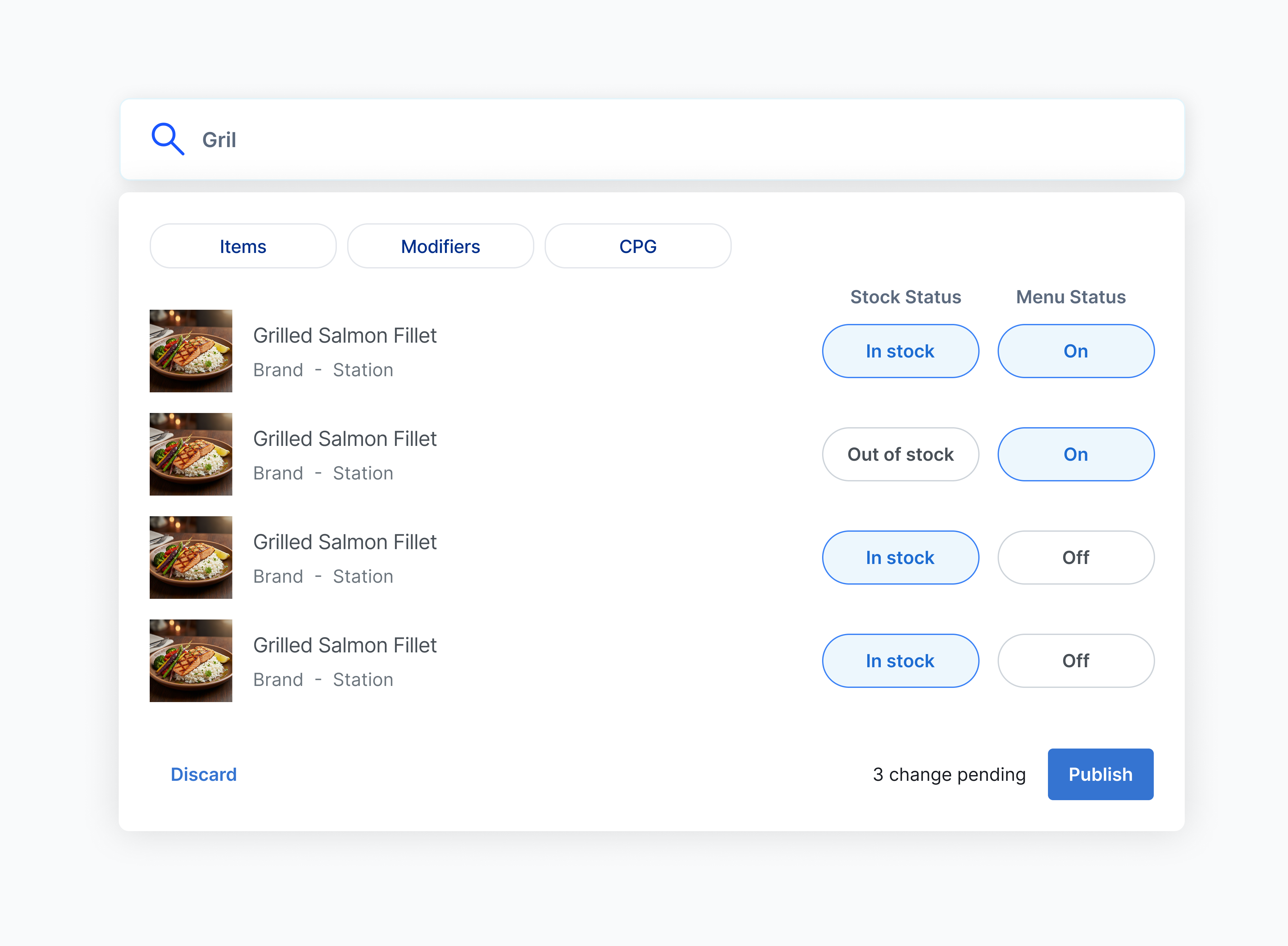
Search modal with stock status, menu status toggles, and batch publish
The design direction
With the firefighting layer addressed and the proactive opportunity defined, every design decision came back to one question: is this shifting the operator from reacting to knowing?
01
Surface firefighting actions first
Rather than fighting the behavior we observed, we designed with it. The most common reasons operators came in became the primary content. Instead of navigating away to fix a problem, operators could begin addressing it from the homepage itself.
02
Frame data through the lens of the guest experience
Operators think in guest experience first, not business metrics. Every data point was framed around what it meant for guests. Seasoned operators recognize the signals immediately. Newer operators start building that intuition week over week.
03
Tell a story operators can share
Because operators need to communicate performance upward and downward, we designed the data presentation to be readable and shareable — not just a personal dashboard but a communication tool.
04
Make recommendations completable, not overwhelming
Item descriptions and images — best practices that lift all metrics — are surfaced as actions operators can complete in seconds using AI-generated content. Three recommendations per day, driven by Miller's Law. Operators can feel done rather than behind.
05
Design a foundation, not just a feature
Every layer was designed with the next layer in mind. The snapshot metrics set the baseline. The recommendations address obvious improvements. The future layer — alerts when metrics trend wrong — has somewhere to live because the foundation was built for it.
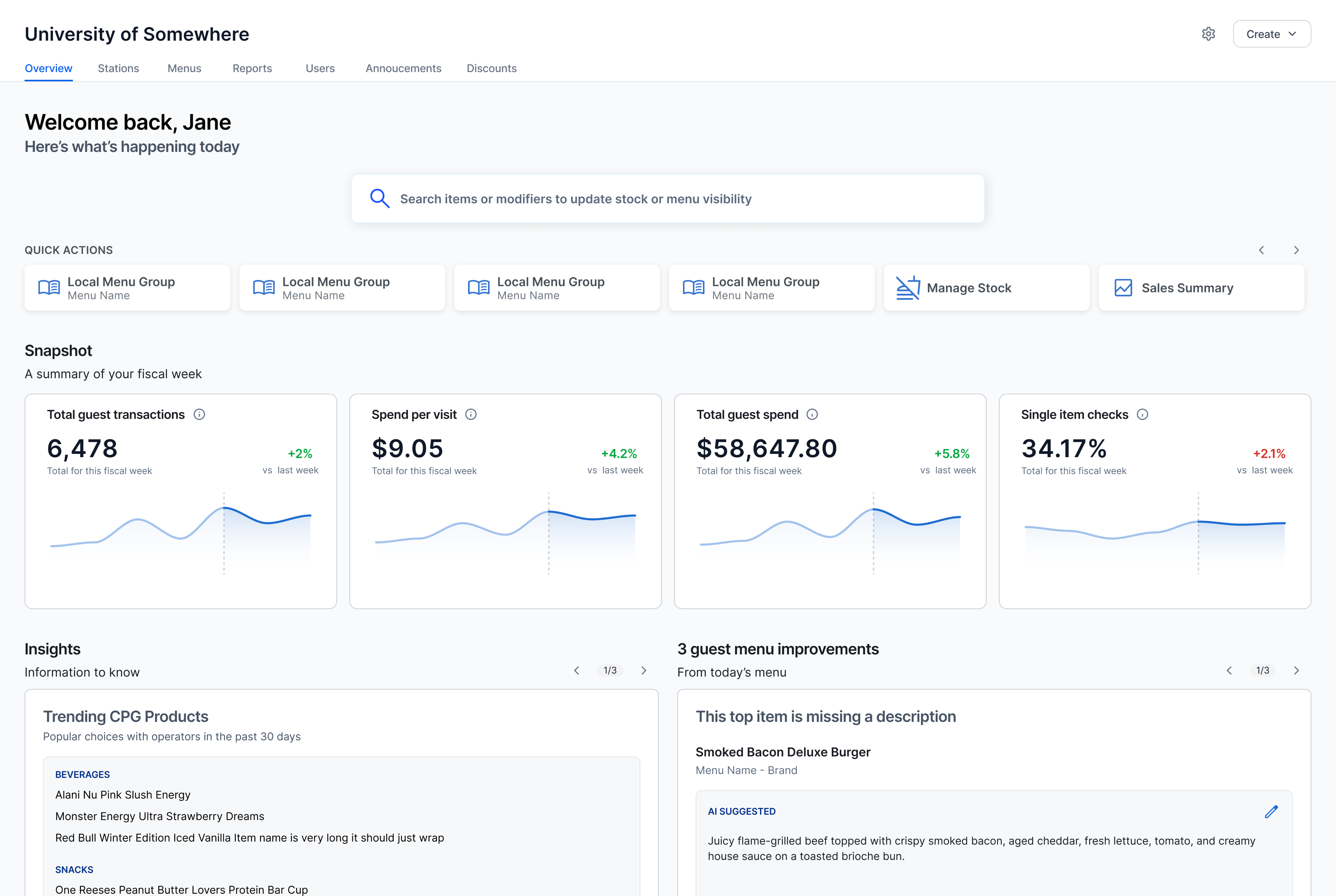
Revised overview page
Testing and validation
The redesign was validated through moderated user testing sessions with real operators. Sessions focused on two questions: Does the homepage help you do what you came to do faster? Does it surface anything you didn't know you needed?
The firefighting action surface tested strongly on the first question. The guest experience framing and recommendations layer tested strongly on the second — operators responded to seeing their work in terms of guest impact in a way they hadn't anticipated.
Status and next steps
The redesign has been validated through user testing and is awaiting development. The snapshot metrics are the first layer — giving operators an honest read on how their site is performing week over week.
The second layer is already being designed. The insights team is building alert logic on top of this foundation — notifying operators when metrics start trending in the wrong direction before the fire starts.
Metrics to follow post-launch.

Reflection
The most important decision on this project wasn't a design decision — it was the decision to stop and ask why before designing anything.
Near zero adoption on a launched product is easy to explain away. It's harder to sit with it, go back to operators, and let what you hear completely change your assumptions.
Operators don't browse. They firefight.
Once I understood that, every decision that followed became obvious. But the real opportunity wasn't just solving the fire — it was building something that helps operators see the smoke before it starts.

Joshua Lee
Work
About
Designing for the Firefight
Sole designer with full ownership across research, strategy, and design — from uncovering why the pilot failed through to a validated redesign.
Role
Lead Product Designer
Project
End to End Product Design
Company
Compass Digital
The situation
Compass Digital builds operator tools for the restaurant and hospitality industry. The product sits in the middle — taking menu data and surfacing it across multiple integrations to help operators run their sites.
The homepage was meant to be the front door. Leadership had defined the first set of functionality with the goal of promoting features across the platform. Product managers moved quickly to add what was easiest to implement.
Nobody validated whether any of it was what operators actually needed. When we piloted the homepage we found out.
The problem
Near zero interaction with almost everything on the page.
The homepage had been built on two assumptions — that operators would browse the platform to discover features, and that surfacing more functionality would drive more engagement. Both assumptions were wrong.
What we had built was a homepage designed for how we wished operators used the product. Not for how they actually did.
My role
I was the sole designer with full ownership of this project — from research through to the validated redesign. All user interviews, research synthesis, and data analysis were led by me.
One of the challenges I navigated throughout was a product culture where feature requests arrived as solutions rather than problems. Reframing the homepage around actual operator behavior required pushing back on that culture — and at one point making a case that traveled to VP level.
The decision to pause
After the pilot launched, I recruited operators who had participated — real users who had experienced the homepage in a live environment. What I heard was consistent: more questions than answers.
One question gave us our clearest signal. I asked pilot users how they would feel if we removed the homepage entirely.
Nobody fought for it. Absence of attachment is its own kind of data.
This wasn't a small decision. The homepage had high visibility across senior leadership. My PM took the insights and data I had surfaced to her director, who made the case upward to VP level. Leadership trusted the evidence enough to pause a high visibility release and give us ownership to redesign it properly.
What we learned
01
Operators don't browse. They firefight.
The one feature with any meaningful interaction was a quick link to navigate away and fix a problem. Every assumption the homepage had been built on was contradicted by how operators actually behaved.
02
Operators care about guests more than the business.
When we talked about data, operators didn't light up at revenue numbers. They lit up when we talked about the guest experience. They also told us they need to tell a story — upward to their district managers, downward to their staff.
03
The tool feels like work, not like it works for them.
Operators feel like they have to use the product rather than want to. The opportunity is to shift that — make the product work for the operator rather than the other way around.
04
Key man risk is real and undiscussed.
Operators rely on years of experience to know what good looks like for their site. When experienced operators leave, that knowledge goes with them. New operators start from zero.
The deeper question
Solving the firefighting problem kept operators on the page. But it raised a harder question — once they're here, what happens next?
A quote from a former operator pointed the way. They told us that operators take years to intuitively know what good looks like for their site. New operators don't have that knowledge. Experienced operators carry it in their heads with nowhere to put it.
Operators take years to intuitively know what good means for their site. The homepage could be where the product carries that knowledge for them.
The goal shifted: move operator behavior from reactive to proactive. Better guest experience, happier clients, and a product that works for operators instead of the other way around.
What we could and couldn’t show
To shift operators from reactive to proactive, we needed to show meaningful signals about how their site was performing. Early on we explored showing weekly sales with projected forecasts.
But when we dug into the data infrastructure we hit a hard constraint. Due to the breadth of our integrations, sales data had incomplete coverage and didn't hit our system quickly enough to be actionable.
We pulled it. And we designed around what we could show with 100% confidence — a snapshot of four key metrics at a fiscal week level: Total Transactions, Spend Per Visit, Total Guest Spend, and Single Item Checks.
We didn't show everything. We showed what we could stand behind. There's a difference between incomplete data and honest data.
Four metrics at fiscal week level with prior week comparison
Designing with real constraints
We wanted to surface menu edits directly on the homepage. To understand what was feasible, I worked with developers across multiple pods to understand how our data was structured and what APIs were available.
Each individual menu change required separate API calls to write to our database and push updates to integration partners. Making individual calls would slow the platform and risk failures in data delivery.
I redesigned the interaction to batch changes into a single publish action.
Search modal with stock status, menu status toggles, and batch publish
The design direction
With the firefighting layer addressed and the proactive opportunity defined, every design decision came back to one question: is this shifting the operator from reacting to knowing?
01
Surface firefighting actions first
Rather than fighting the behavior we observed, we designed with it. The most common reasons operators came in became the primary content. Instead of navigating away to fix a problem, operators could begin addressing it from the homepage itself.
02
Frame data through the lens of the guest experience
Operators think in guest experience first, not business metrics. Every data point was framed around what it meant for guests. Seasoned operators recognize the signals immediately. Newer operators start building that intuition week over week.
03
Tell a story operators can share
Because operators need to communicate performance upward and downward, we designed the data presentation to be readable and shareable — not just a personal dashboard but a communication tool.
04
Make recommendations completable, not overwhelming
Item descriptions and images — best practices that lift all metrics — are surfaced as actions operators can complete in seconds using AI-generated content. Three recommendations per day, driven by Miller's Law. Operators can feel done rather than behind.
05
Design a foundation, not just a feature
Every layer was designed with the next layer in mind. The snapshot metrics set the baseline. The recommendations address obvious improvements. The future layer — alerts when metrics trend wrong — has somewhere to live because the foundation was built for it.
Revised overview page
Testing and validation
The redesign was validated through moderated user testing sessions with real operators. Sessions focused on two questions: Does the homepage help you do what you came to do faster? Does it surface anything you didn't know you needed?
The firefighting action surface tested strongly on the first question. The guest experience framing and recommendations layer tested strongly on the second — operators responded to seeing their work in terms of guest impact in a way they hadn't anticipated.
Status and next steps
The redesign has been validated through user testing and is awaiting development. The snapshot metrics are the first layer — giving operators an honest read on how their site is performing week over week.
The second layer is already being designed. The insights team is building alert logic on top of this foundation — notifying operators when metrics start trending in the wrong direction before the fire starts.
Metrics to follow post-launch.

Reflection
The most important decision on this project wasn't a design decision — it was the decision to stop and ask why before designing anything.
Near zero adoption on a launched product is easy to explain away. It's harder to sit with it, go back to operators, and let what you hear completely change your assumptions.
Operators don't browse. They firefight.
Once I understood that, every decision that followed became obvious. But the real opportunity wasn't just solving the fire — it was building something that helps operators see the smoke before it starts.

Joshua Lee
Work
About
Designing for the Firefight
Sole designer with full ownership across research, strategy, and design — from uncovering why the pilot failed through to a validated redesign.
Role
Lead Product Designer
Project
End to End Product Design
Company
Compass Digital
The situation
Compass Digital builds operator tools for the restaurant and hospitality industry. The product sits in the middle — taking menu data and surfacing it across multiple integrations to help operators run their sites.
The homepage was meant to be the front door. Leadership had defined the first set of functionality with the goal of promoting features across the platform. Product managers moved quickly to add what was easiest to implement.
Nobody validated whether any of it was what operators actually needed. When we piloted the homepage we found out.
The problem
Near zero interaction with almost everything on the page.
The homepage had been built on two assumptions — that operators would browse the platform to discover features, and that surfacing more functionality would drive more engagement. Both assumptions were wrong.
What we had built was a homepage designed for how we wished operators used the product. Not for how they actually did.
My role
I was the sole designer with full ownership of this project — from research through to the validated redesign. All user interviews, research synthesis, and data analysis were led by me.
One of the challenges I navigated throughout was a product culture where feature requests arrived as solutions rather than problems. Reframing the homepage around actual operator behavior required pushing back on that culture — and at one point making a case that traveled to VP level.
The decision to pause
After the pilot launched, I recruited operators who had participated — real users who had experienced the homepage in a live environment. What I heard was consistent: more questions than answers.
One question gave us our clearest signal. I asked pilot users how they would feel if we removed the homepage entirely.
Nobody fought for it. Absence of attachment is its own kind of data.
This wasn't a small decision. The homepage had high visibility across senior leadership. My PM took the insights and data I had surfaced to her director, who made the case upward to VP level. Leadership trusted the evidence enough to pause a high visibility release and give us ownership to redesign it properly.
What we learned
01
Operators don't browse. They firefight.
The one feature with any meaningful interaction was a quick link to navigate away and fix a problem. Every assumption the homepage had been built on was contradicted by how operators actually behaved.
02
Operators care about guests more than the business.
When we talked about data, operators didn't light up at revenue numbers. They lit up when we talked about the guest experience. They also told us they need to tell a story — upward to their district managers, downward to their staff.
03
The tool feels like work, not like it works for them.
Operators feel like they have to use the product rather than want to. The opportunity is to shift that — make the product work for the operator rather than the other way around.
04
Key man risk is real and undiscussed.
Operators rely on years of experience to know what good looks like for their site. When experienced operators leave, that knowledge goes with them. New operators start from zero.
The deeper question
Solving the firefighting problem kept operators on the page. But it raised a harder question — once they're here, what happens next?
A quote from a former operator pointed the way. They told us that operators take years to intuitively know what good looks like for their site. New operators don't have that knowledge. Experienced operators carry it in their heads with nowhere to put it.
Operators take years to intuitively know what good means for their site. The homepage could be where the product carries that knowledge for them.
The goal shifted: move operator behavior from reactive to proactive. Better guest experience, happier clients, and a product that works for operators instead of the other way around.
What we could and couldn’t show
To shift operators from reactive to proactive, we needed to show meaningful signals about how their site was performing. Early on we explored showing weekly sales with projected forecasts.
But when we dug into the data infrastructure we hit a hard constraint. Due to the breadth of our integrations, sales data had incomplete coverage and didn't hit our system quickly enough to be actionable.
We pulled it. And we designed around what we could show with 100% confidence — a snapshot of four key metrics at a fiscal week level: Total Transactions, Spend Per Visit, Total Guest Spend, and Single Item Checks.
We didn't show everything. We showed what we could stand behind. There's a difference between incomplete data and honest data.
Four metrics at fiscal week level with prior week comparison
Designing with real constraints
We wanted to surface menu edits directly on the homepage. To understand what was feasible, I worked with developers across multiple pods to understand how our data was structured and what APIs were available.
Each individual menu change required separate API calls to write to our database and push updates to integration partners. Making individual calls would slow the platform and risk failures in data delivery.
I redesigned the interaction to batch changes into a single publish action.
Search modal with stock status, menu status toggles, and batch publish
The design direction
With the firefighting layer addressed and the proactive opportunity defined, every design decision came back to one question: is this shifting the operator from reacting to knowing?
01
Surface firefighting actions first
Rather than fighting the behavior we observed, we designed with it. The most common reasons operators came in became the primary content. Instead of navigating away to fix a problem, operators could begin addressing it from the homepage itself.
02
Frame data through the lens of the guest experience
Operators think in guest experience first, not business metrics. Every data point was framed around what it meant for guests. Seasoned operators recognize the signals immediately. Newer operators start building that intuition week over week.
03
Tell a story operators can share
Because operators need to communicate performance upward and downward, we designed the data presentation to be readable and shareable — not just a personal dashboard but a communication tool.
04
Make recommendations completable, not overwhelming
Item descriptions and images — best practices that lift all metrics — are surfaced as actions operators can complete in seconds using AI-generated content. Three recommendations per day, driven by Miller's Law. Operators can feel done rather than behind.
05
Design a foundation, not just a feature
Every layer was designed with the next layer in mind. The snapshot metrics set the baseline. The recommendations address obvious improvements. The future layer — alerts when metrics trend wrong — has somewhere to live because the foundation was built for it.
Revised overview page
Testing and validation
The redesign was validated through moderated user testing sessions with real operators. Sessions focused on two questions: Does the homepage help you do what you came to do faster? Does it surface anything you didn't know you needed?
The firefighting action surface tested strongly on the first question. The guest experience framing and recommendations layer tested strongly on the second — operators responded to seeing their work in terms of guest impact in a way they hadn't anticipated.
Status and next steps
The redesign has been validated through user testing and is awaiting development. The snapshot metrics are the first layer — giving operators an honest read on how their site is performing week over week.
The second layer is already being designed. The insights team is building alert logic on top of this foundation — notifying operators when metrics start trending in the wrong direction before the fire starts.
Metrics to follow post-launch.

Reflection
The most important decision on this project wasn't a design decision — it was the decision to stop and ask why before designing anything.
Near zero adoption on a launched product is easy to explain away. It's harder to sit with it, go back to operators, and let what you hear completely change your assumptions.
Operators don't browse. They firefight.
Once I understood that, every decision that followed became obvious. But the real opportunity wasn't just solving the fire — it was building something that helps operators see the smoke before it starts.
