JL
Work
About
They Weren't Avoiding It. They Didn't Trust It.
Senior designer responsible for discovery, user research, iteration, and UX design of the Insights platform. Visual design and branding handled by a separate designer at Rangle.
Role
Senior Product Designer
Project
Insights platform redeisgn
Company
Medtronic

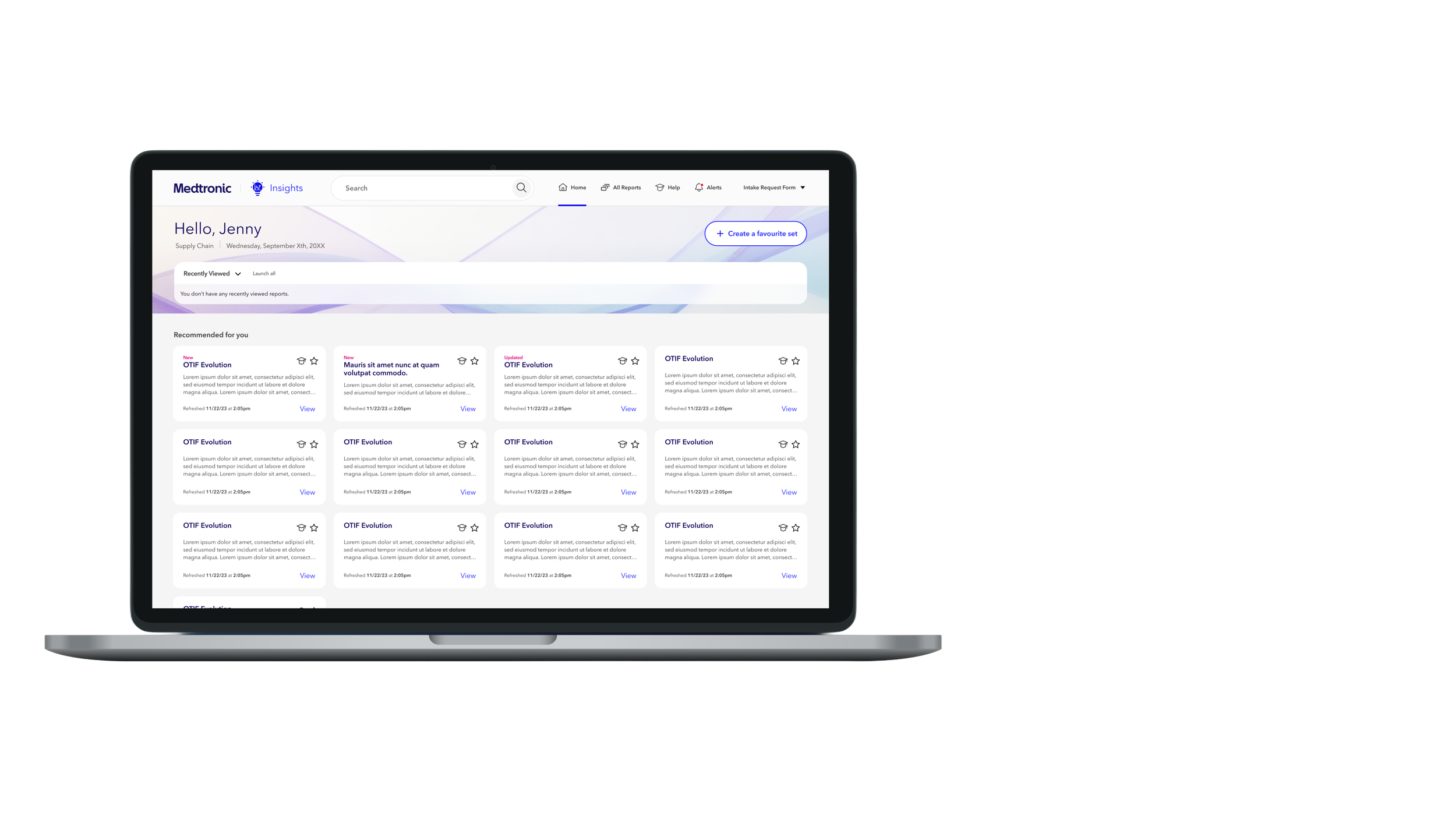
The setup
10,000 Medtronic employees had access to Insights — an internal platform housing Power BI reports to help the business make better decisions.
Less than half actually used it.
Medtronic engaged Rangle to improve the first-mile experience and make the platform less intimidating for new users. We redesigned it. We launched a pilot. And then we found out the redesign had its own problem.
80% of pilot users were still going back to the old app.
What we got wrong
The pilot survey gave us three reasons users were abandoning the new app: app stability, feature parity, and missing the old all-reports view. The first two were engineering problems with clear solutions.
The third one was more interesting.
Users said they missed the old view. But what did that actually mean? Our instinct was that users just needed to discover search. Our analytics seemed to confirm this — search was being used at a reasonable rate.
We were wrong to trust that data.
The answer wasn’t in the analytics
When we dug into the users who were abandoning the new app and returning to the old one, we noticed something the analytics hadn't shown us: none of them had used search at all.
So we went back to users and asked why.
"Ohh, look at that, so maybe it's not as big of a deal as I thought... didn't realize it would pop up keywords like that."
— Tom, EPX Pilot User
Users weren't avoiding our search because it was bad.
They weren't avoiding it because it was hard to find.
They were avoiding it because years of poor internal tooling had quietly trained them not to bother trying.
Every search function across Medtronic's internal applications had let them down before. Ours was being judged not on its own merits — but against a graveyard of tools that had already failed them.
We didn't have a search quality problem. We didn't even have a discoverability problem. We had a trust problem. And those require completely different solutions.
The smallest viable test
Once we understood the real problem, we had a decision to make. We could rebuild the search experience from the ground up. Or we could test our hypothesis with the smallest possible change first.
We changed the placeholder text from 'Search' to 'Search by title, description or keyword.'
Not because we thought it would solve everything. Because it was the fastest way to signal search capability and measure whether perception was the real barrier — before investing in a larger solution.
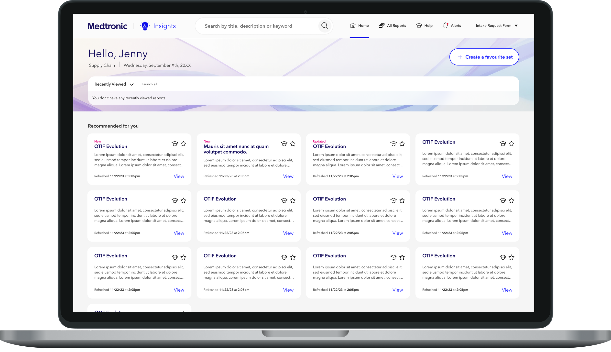
Updated search placeholder
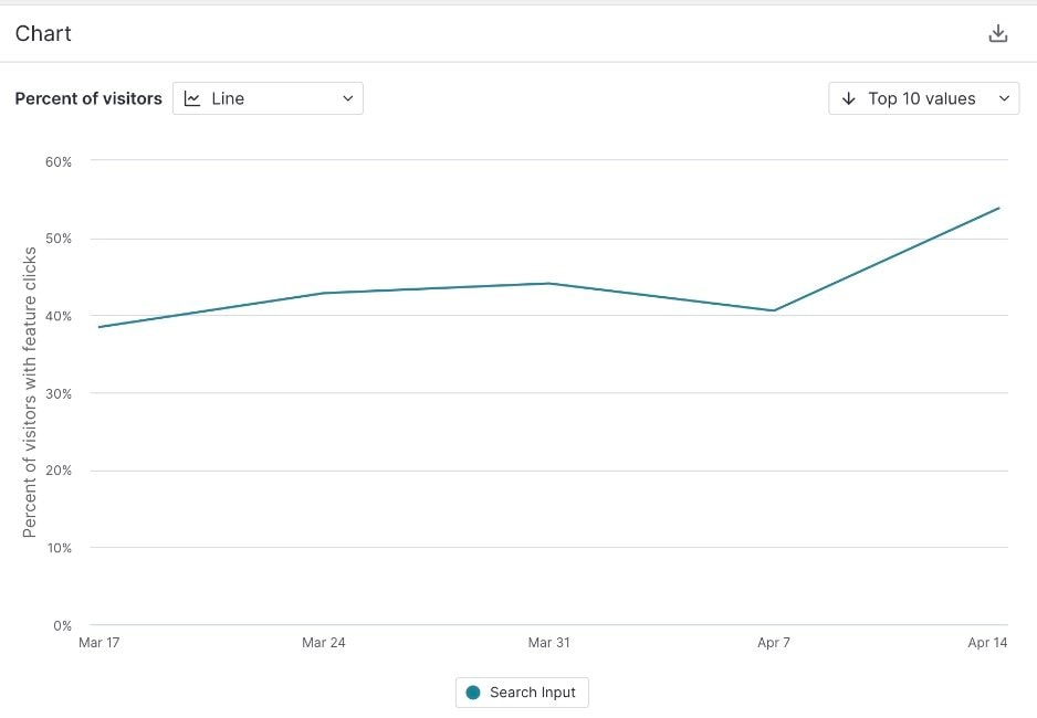
14% increase in search usage from a single placeholder text change
The mental model we had broken
The old app had a specific layout: users selected a department, then scanned subcategories arranged in columns. It wasn't beautiful. But it had given thousands of employees a mental model they'd internalized over years of use.
Our redesign had replaced that column structure with a left navigation and an infinite scroll. It was cleaner. It was more modern. And it had completely broken how users knew how to find things.
We hadn't just redesigned the UI. We had taken away the spatial memory users had built up over years and replaced it with something that required them to learn from scratch.
Finding the right solution
Iteration 01 — Improved landmarking
Better visual anchors to help users maintain position while scrolling. Reduced confusion but didn't solve the fundamental problem of one long undifferentiated list.
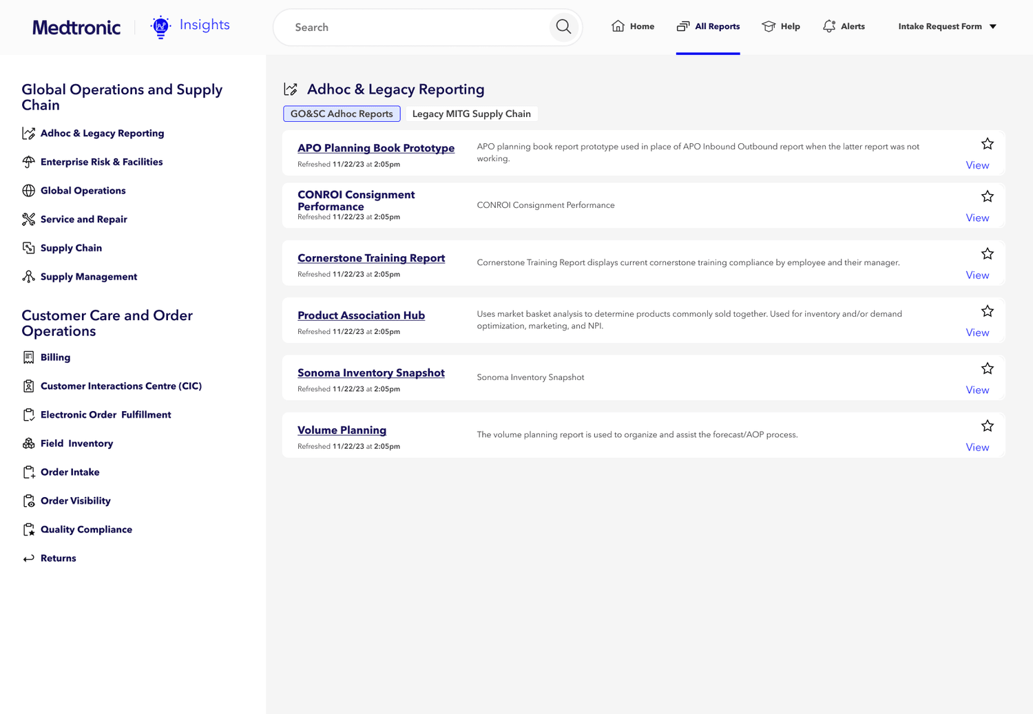
Improved landmarking approach
Iteration 02 — Table format
A filterable, searchable table view. Tested well with power users who knew what they were looking for. Didn't help users who were browsing by function.
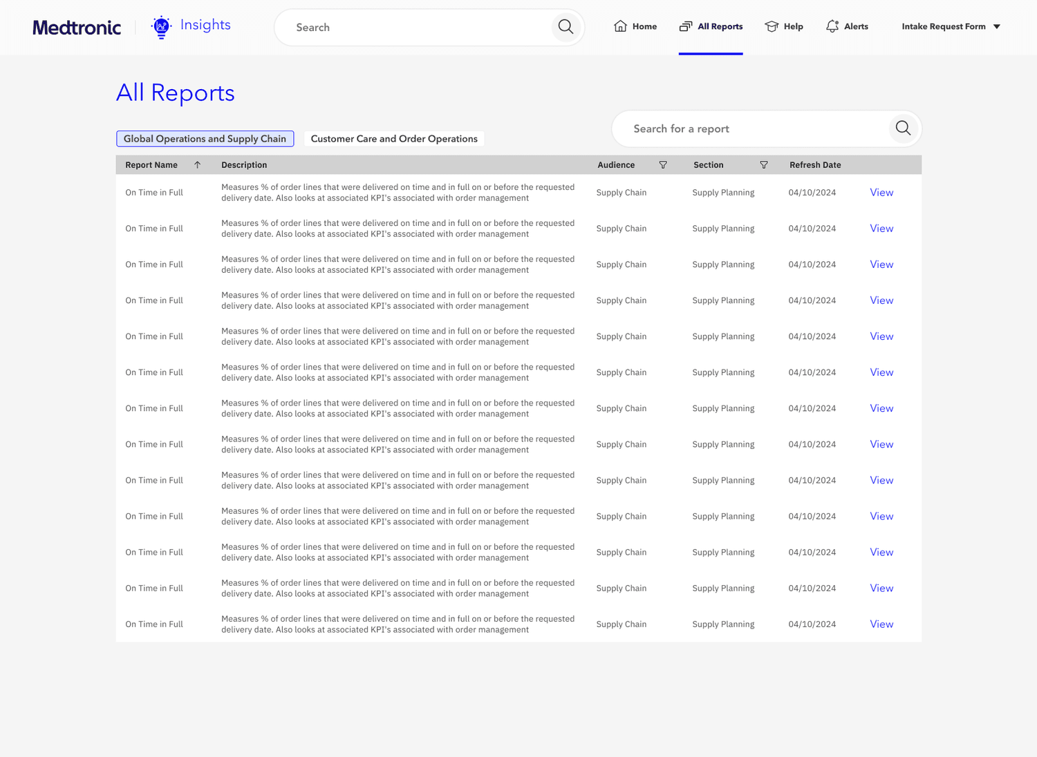
Table format exploration
Iteration 03 — Tabs with department separation
Tabs that replicated the column-based mental model of the old app — separating departments clearly — while making it more digestible for new users who hadn't built up the same muscle memory.
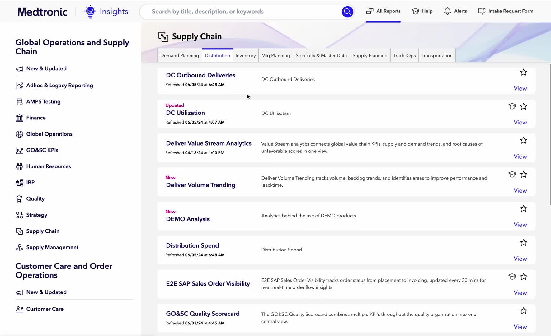
Tab structure with department separation
Testing the solution
To validate the new direction we asked users to find an unfamiliar report in both the existing pilot app and a clickable prototype of the new design.
In the pilot design, two of four users missed the report on the first attempt. In the new design, all four found it immediately.
Outcomes
80% → 25% exit rate reduction — giving Medtronic confidence to release to the full user base
That meant thousands of additional employees finally able to access the business intelligence the platform had always promised.

Reflection
The most important moment in this project wasn't a design decision. It was the decision to stop trusting the analytics.
Our data said search was being used. Our instinct said users just needed to discover it better. Both were wrong — and if we'd acted on either without going back to users, we would have built the wrong solution confidently.
Sometimes the most important thing you can do is ignore what the data is telling you and go listen to a person instead.

Joshua Lee
Work
About
They Weren't Avoiding It. They Didn't Trust It.
Senior designer responsible for discovery, user research, iteration, and UX design of the Insights platform. Visual design and branding handled by a separate designer at Rangle.
Role
Senior Product Designer
Project
Insights platform redeisgn
Company
Medtronic
The setup
10,000 Medtronic employees had access to Insights — an internal platform housing Power BI reports to help the business make better decisions.
Less than half actually used it.
Medtronic engaged Rangle to improve the first-mile experience and make the platform less intimidating for new users. We redesigned it. We launched a pilot. And then we found out the redesign had its own problem.
80% of pilot users were still going back to the old app.
What we got wrong
The pilot survey gave us three reasons users were abandoning the new app: app stability, feature parity, and missing the old all-reports view. The first two were engineering problems with clear solutions.
The third one was more interesting.
Users said they missed the old view. But what did that actually mean? Our instinct was that users just needed to discover search. Our analytics seemed to confirm this — search was being used at a reasonable rate.
We were wrong to trust that data.
The answer wasn’t in the analytics
When we dug into the users who were abandoning the new app and returning to the old one, we noticed something the analytics hadn't shown us: none of them had used search at all.
So we went back to users and asked why.
"Ohh, look at that, so maybe it's not as big of a deal as I thought... didn't realize it would pop up keywords like that."
— Tom, EPX Pilot User
Users weren't avoiding our search because it was bad.
They weren't avoiding it because it was hard to find.
They were avoiding it because years of poor internal tooling had quietly trained them not to bother trying.
Every search function across Medtronic's internal applications had let them down before. Ours was being judged not on its own merits — but against a graveyard of tools that had already failed them.
We didn't have a search quality problem. We didn't even have a discoverability problem. We had a trust problem. And those require completely different solutions.
The smallest viable test
Once we understood the real problem, we had a decision to make. We could rebuild the search experience from the ground up. Or we could test our hypothesis with the smallest possible change first.
We changed the placeholder text from 'Search' to 'Search by title, description or keyword.'
Not because we thought it would solve everything. Because it was the fastest way to signal search capability and measure whether perception was the real barrier — before investing in a larger solution.
Updated search placeholder
14% increase in search usage from a single placeholder text change
The mental model we had broken
The old app had a specific layout: users selected a department, then scanned subcategories arranged in columns. It wasn't beautiful. But it had given thousands of employees a mental model they'd internalized over years of use.
Our redesign had replaced that column structure with a left navigation and an infinite scroll. It was cleaner. It was more modern. And it had completely broken how users knew how to find things.
We hadn't just redesigned the UI. We had taken away the spatial memory users had built up over years and replaced it with something that required them to learn from scratch.
Finding the right solution
Iteration 01 — Improved landmarking
Better visual anchors to help users maintain position while scrolling. Reduced confusion but didn't solve the fundamental problem of one long undifferentiated list.
Improved landmarking approach
Iteration 02 — Table format
A filterable, searchable table view. Tested well with power users who knew what they were looking for. Didn't help users who were browsing by function.
Table format exploration
Iteration 03 — Tabs with department separation
Tabs that replicated the column-based mental model of the old app — separating departments clearly — while making it more digestible for new users who hadn't built up the same muscle memory.
Tab structure with department separation
Testing the solution
To validate the new direction we asked users to find an unfamiliar report in both the existing pilot app and a clickable prototype of the new design.
In the pilot design, two of four users missed the report on the first attempt. In the new design, all four found it immediately.
Outcomes
80% → 25% exit rate reduction — giving Medtronic confidence to release to the full user base
That meant thousands of additional employees finally able to access the business intelligence the platform had always promised.

Reflection
The most important moment in this project wasn't a design decision. It was the decision to stop trusting the analytics.
Our data said search was being used. Our instinct said users just needed to discover it better. Both were wrong — and if we'd acted on either without going back to users, we would have built the wrong solution confidently.
Sometimes the most important thing you can do is ignore what the data is telling you and go listen to a person instead.

Joshua Lee
Work
About
They Weren't Avoiding It. They Didn't Trust It.
Senior designer responsible for discovery, user research, iteration, and UX design of the Insights platform. Visual design and branding handled by a separate designer at Rangle.
Role
Senior Product Designer
Project
Insights platform redeisgn
Company
Medtronic
The setup
10,000 Medtronic employees had access to Insights — an internal platform housing Power BI reports to help the business make better decisions.
Less than half actually used it.
Medtronic engaged Rangle to improve the first-mile experience and make the platform less intimidating for new users. We redesigned it. We launched a pilot. And then we found out the redesign had its own problem.
80% of pilot users were still going back to the old app.
What we got wrong
The pilot survey gave us three reasons users were abandoning the new app: app stability, feature parity, and missing the old all-reports view. The first two were engineering problems with clear solutions.
The third one was more interesting.
Users said they missed the old view. But what did that actually mean? Our instinct was that users just needed to discover search. Our analytics seemed to confirm this — search was being used at a reasonable rate.
We were wrong to trust that data.
The answer wasn’t in the analytics
When we dug into the users who were abandoning the new app and returning to the old one, we noticed something the analytics hadn't shown us: none of them had used search at all.
So we went back to users and asked why.
"Ohh, look at that, so maybe it's not as big of a deal as I thought... didn't realize it would pop up keywords like that."
— Tom, EPX Pilot User
Users weren't avoiding our search because it was bad.
They weren't avoiding it because it was hard to find.
They were avoiding it because years of poor internal tooling had quietly trained them not to bother trying.
Every search function across Medtronic's internal applications had let them down before. Ours was being judged not on its own merits — but against a graveyard of tools that had already failed them.
We didn't have a search quality problem. We didn't even have a discoverability problem. We had a trust problem. And those require completely different solutions.
The smallest viable test
Once we understood the real problem, we had a decision to make. We could rebuild the search experience from the ground up. Or we could test our hypothesis with the smallest possible change first.
We changed the placeholder text from 'Search' to 'Search by title, description or keyword.'
Not because we thought it would solve everything. Because it was the fastest way to signal search capability and measure whether perception was the real barrier — before investing in a larger solution.
Updated search placeholder
14% increase in search usage from a single placeholder text change
The mental model we had broken
The old app had a specific layout: users selected a department, then scanned subcategories arranged in columns. It wasn't beautiful. But it had given thousands of employees a mental model they'd internalized over years of use.
Our redesign had replaced that column structure with a left navigation and an infinite scroll. It was cleaner. It was more modern. And it had completely broken how users knew how to find things.
We hadn't just redesigned the UI. We had taken away the spatial memory users had built up over years and replaced it with something that required them to learn from scratch.
Finding the right solution
Iteration 01 — Improved landmarking
Better visual anchors to help users maintain position while scrolling. Reduced confusion but didn't solve the fundamental problem of one long undifferentiated list.
Improved landmarking approach
Iteration 02 — Table format
A filterable, searchable table view. Tested well with power users who knew what they were looking for. Didn't help users who were browsing by function.
Table format exploration
Iteration 03 — Tabs with department separation
Tabs that replicated the column-based mental model of the old app — separating departments clearly — while making it more digestible for new users who hadn't built up the same muscle memory.
Tab structure with department separation
Testing the solution
To validate the new direction we asked users to find an unfamiliar report in both the existing pilot app and a clickable prototype of the new design.
In the pilot design, two of four users missed the report on the first attempt. In the new design, all four found it immediately.
Outcomes
80% → 25% exit rate reduction — giving Medtronic confidence to release to the full user base
That meant thousands of additional employees finally able to access the business intelligence the platform had always promised.

Reflection
The most important moment in this project wasn't a design decision. It was the decision to stop trusting the analytics.
Our data said search was being used. Our instinct said users just needed to discover it better. Both were wrong — and if we'd acted on either without going back to users, we would have built the wrong solution confidently.
Sometimes the most important thing you can do is ignore what the data is telling you and go listen to a person instead.
