Medtronic
Product Manager: Matthew Giesa
Product Designer: Joshua Lee
This project is covered under an NDA.
Some names and design artifacts have been omitted.
Problem
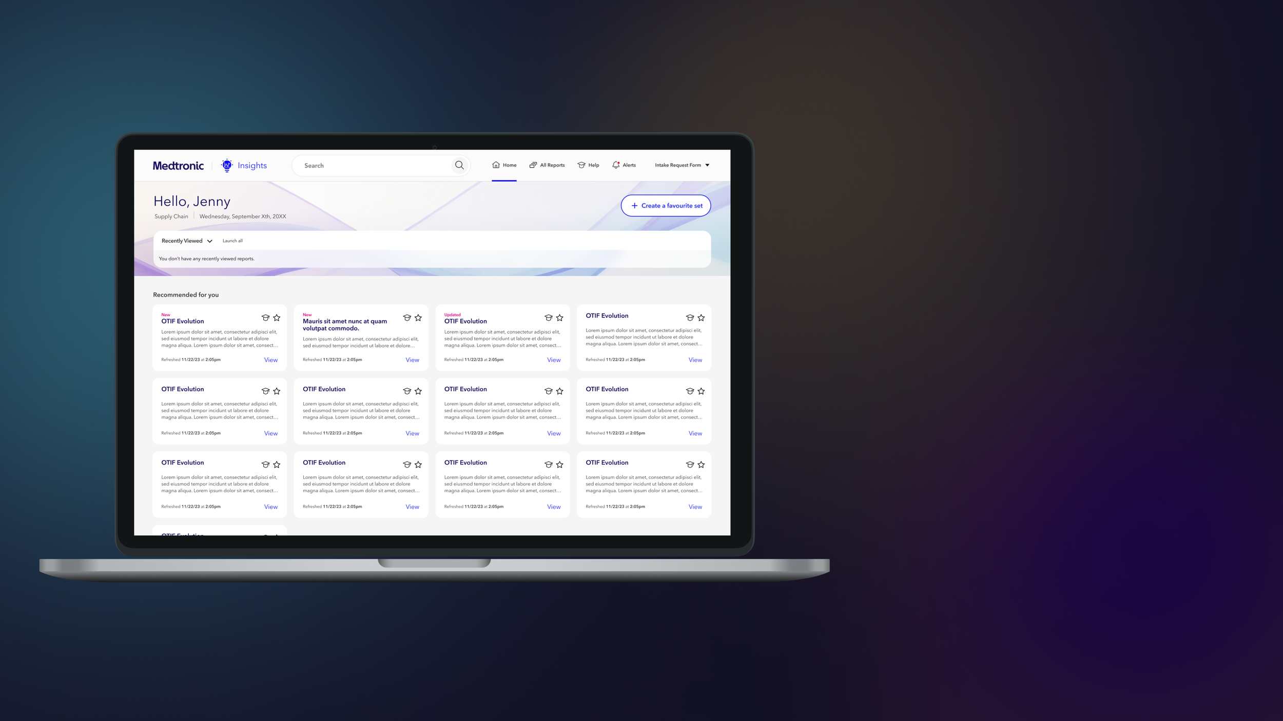
Medtronic, a global medical technology company with over 80,000 employees, developed an internal tool called Insights to help their employees make better business decisions. Insights is a repository of Power BI reports containing up-to-date data about the company's operations. Despite having over ten thousand employees with access to Insights, only about 4,500 users actively use it. Medtronic engaged Rangle to improve the first-mile experience and make the platform less intimidating for new users.
After redesigning Insights, we launched it to a pilot group of users to test if we met our goals. Surveys revealed that 80% of users still needed to use the old app for the following reasons:
1. App stability
2. Feature parity
3. Missing the view of the previous all-reports page
Goal
Decrease the exit rate so that we can feel confident rolling the application out to the rest of the user base and sunset the old application.
Understanding our users needs
The first two reasons were straightforward to address, but we needed to understand why users missed the old all-reports view. We conducted user interviews and discovered that the main task users wanted to complete was finding reports. We thought our newly built search function would be the quickest way for users to find reports. While our analytics told us that search was being used at a decent rate we noticed a theme that users who had to go back to our old app hadn’t used our search at all.
Although we believed our search function was robust enough, users weren't utilizing it. Through interviews, we identified two main reasons for this:
1. Some users had not noticed the search bar.
2. Some users had low expectations of the search function due to poor experiences with other Medtronic applications.
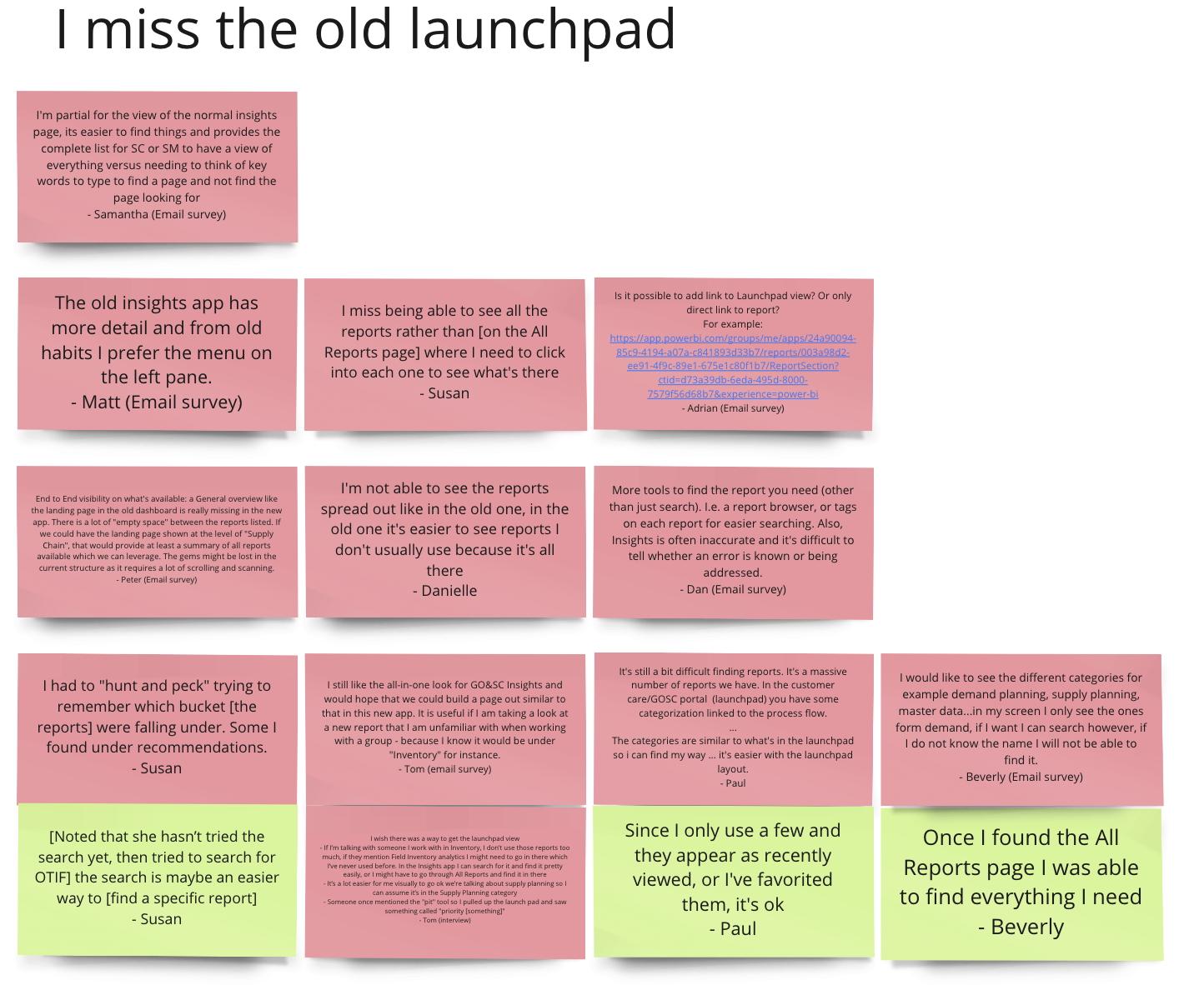
User Feedback about the old view
“Ohh, look at that, so maybe it's not as big of a deal as I thought,... didn’t realize it would pop up keywords like that”
-Tom(EPX Pilot User)
Improving search usage
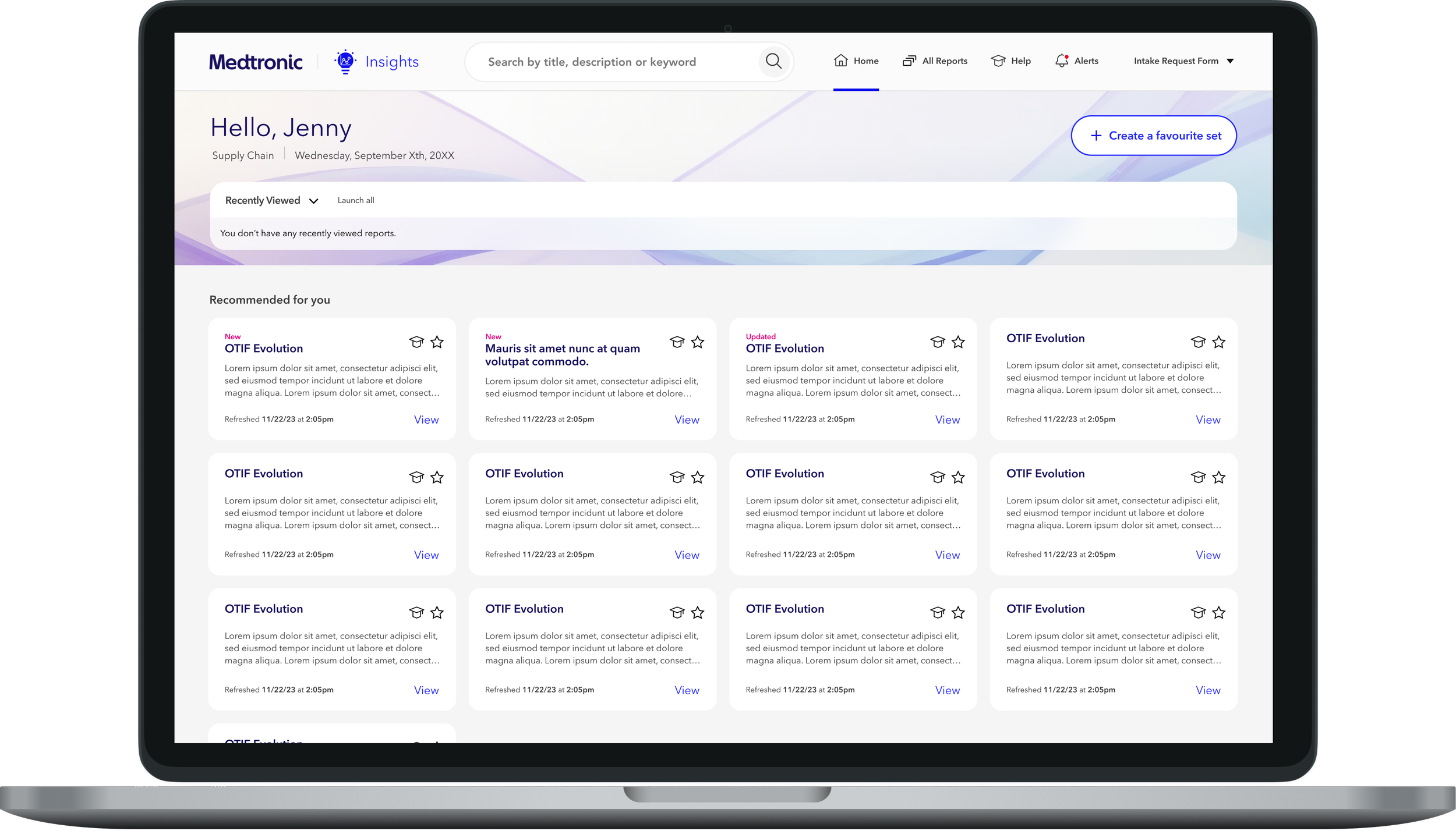
Hearing this feedback gave us confidence that our search was powerful enough and it was a discovery problem. While we knew there were many ways we could fix the issue like; increasing the attention the search bar takes with colour/size/animation, moving the search bar to a more prominent position, introducing some onboarding or walkthroughs, we decided to try just updating the placeholder text from saying “Search” to “Search by title, description or keyword” This was something we could implement right away and track while we worked on other issues. The new placeholder hopefully would give more affordance to the user on what they can search for as well as be more prominent in the header with the longer placeholder text.
Old vs new placeholder text

Metrics
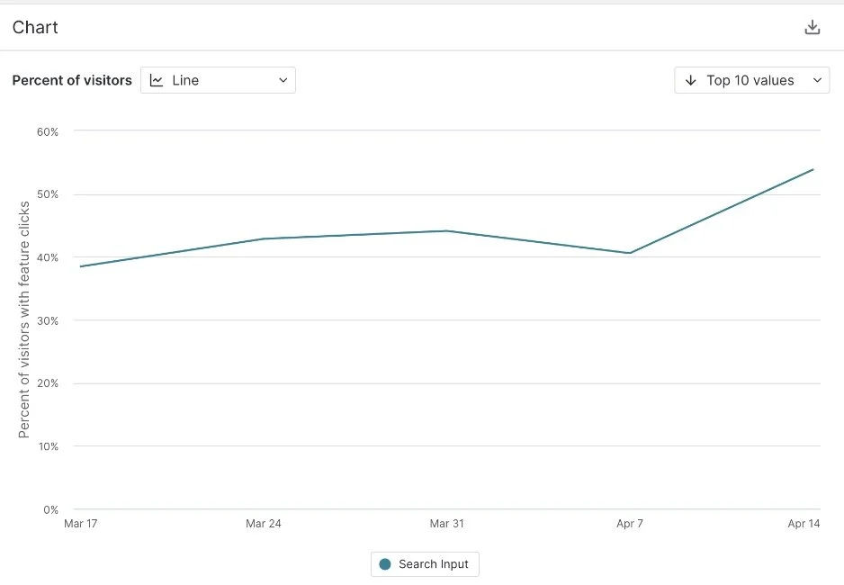
After making the update we tracked the usage of the search functionality compared to the previous amount.
This simple change increased the number of users using the search function by 14%.
Improving the time it takes to find a report
Another task users wanted to accomplish with the old all-reports page was finding reports by function rather than by name. Users would quickly scan the different functions to locate the report they needed. However, our new all-reports page design made this difficult, as it was one long page, causing users to lose their place as they scrolled. We also learned that users generally only looked at one audience group at a time.
Initial Pilot Design- Users were frustrated having to select a department and subcategory in the left nav. While scrolling would allow the user to jump to the next category, it would leave them confused and lost in such a long list.
Why did users have an easier time with the old view?
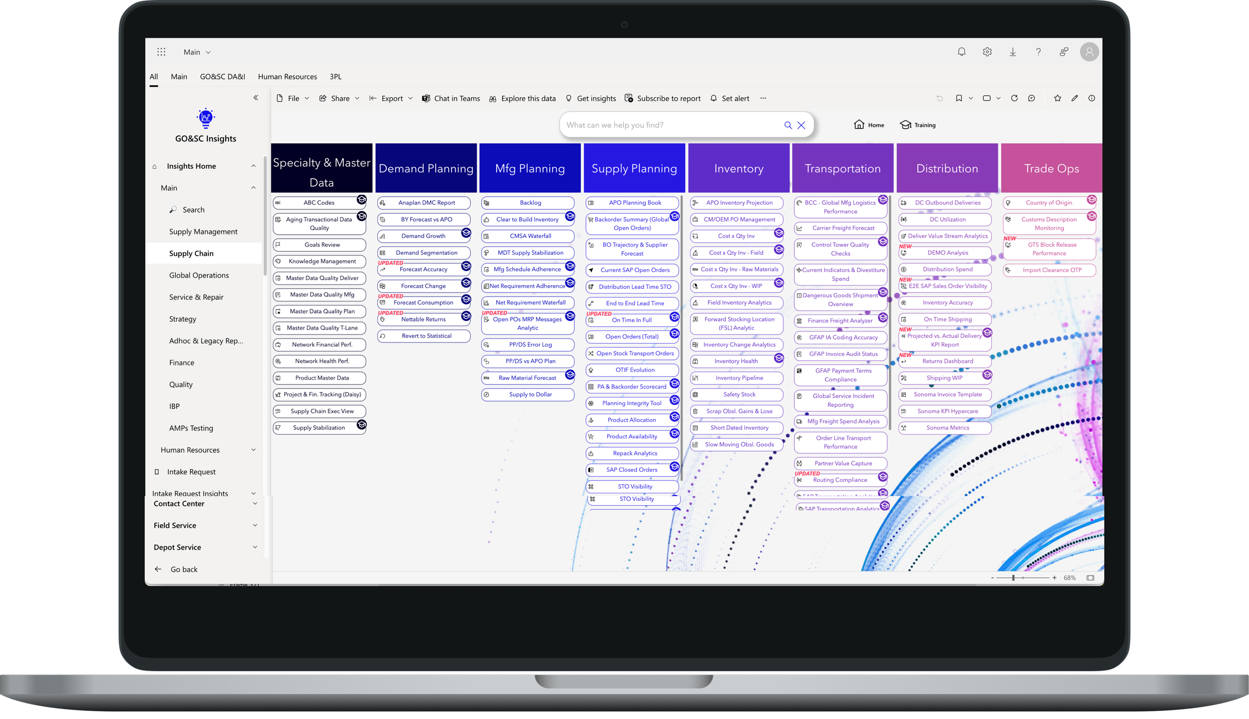
Original Insights App - users would select a department and then look at the subcategories which were separated in columns. When they would finish scanning one they would go to the next column. We had broken their mental model with introducing the subcategories on the left nav, and got them lost in the infinite scroll.
While the old UI was great for users who had used the platform for a while and built in muscle memory new users were completely overwhelmed. To make sure we accomplished our overall goal of adoption we knew we could just replicate the same view in the new UI so that newer users could feel confident to use the platform.
Some of the iterations
Iteration 1: Improved landmarking when scrolling
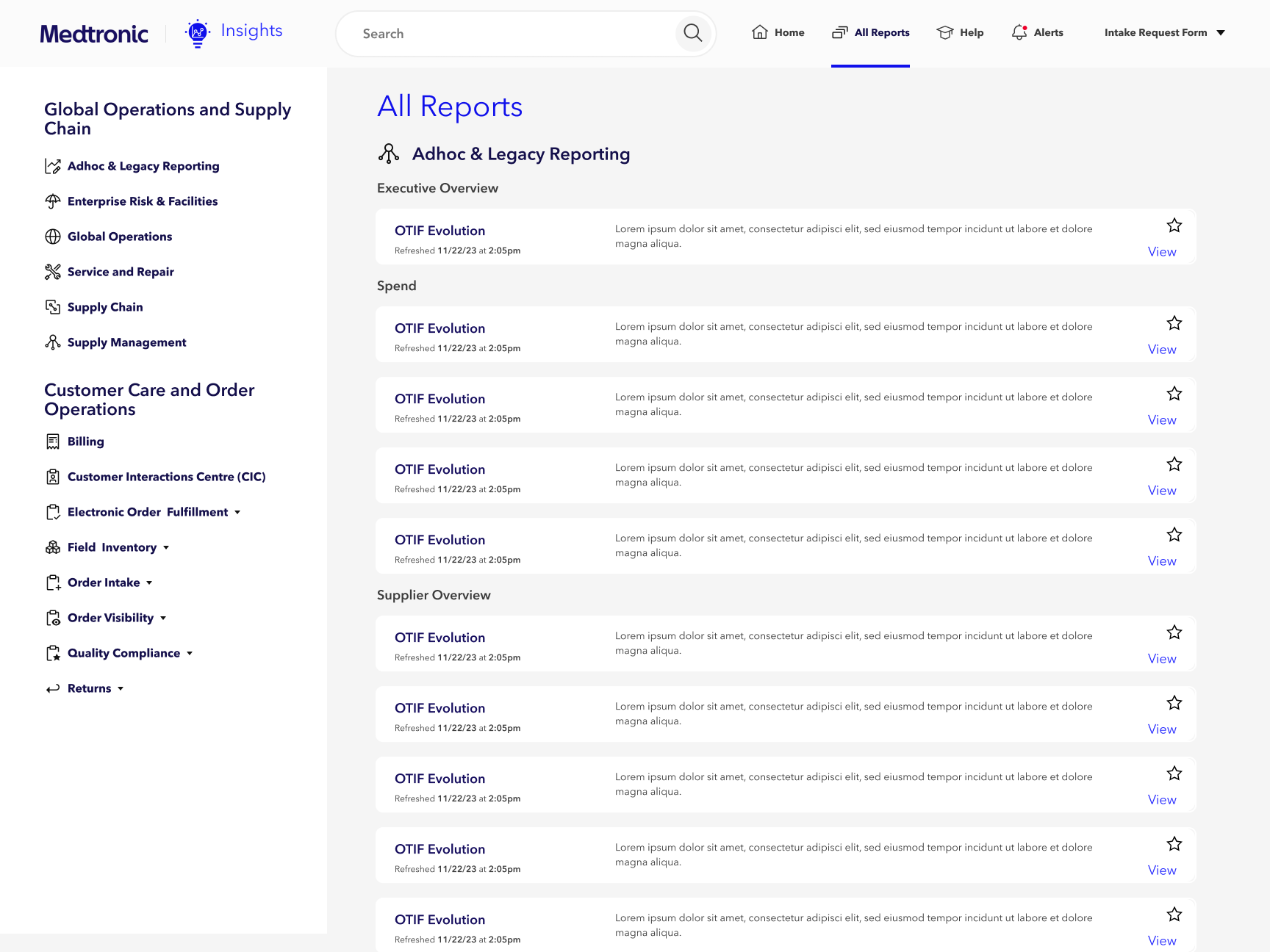
Iteration 2: Table format to filter and search against
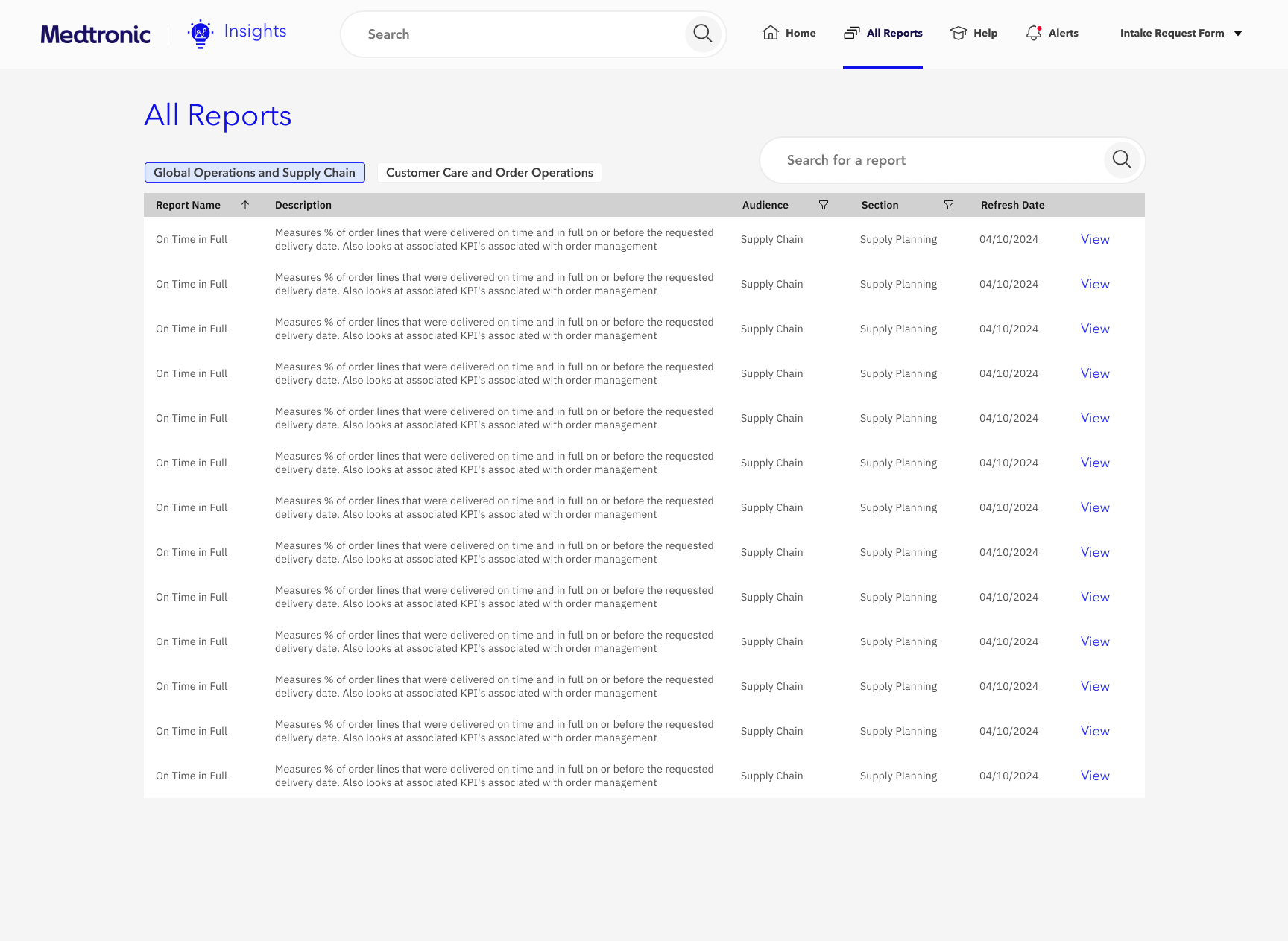
Iteration 3: Adding tabs and separating out the department and subcategory
Testing and Validation
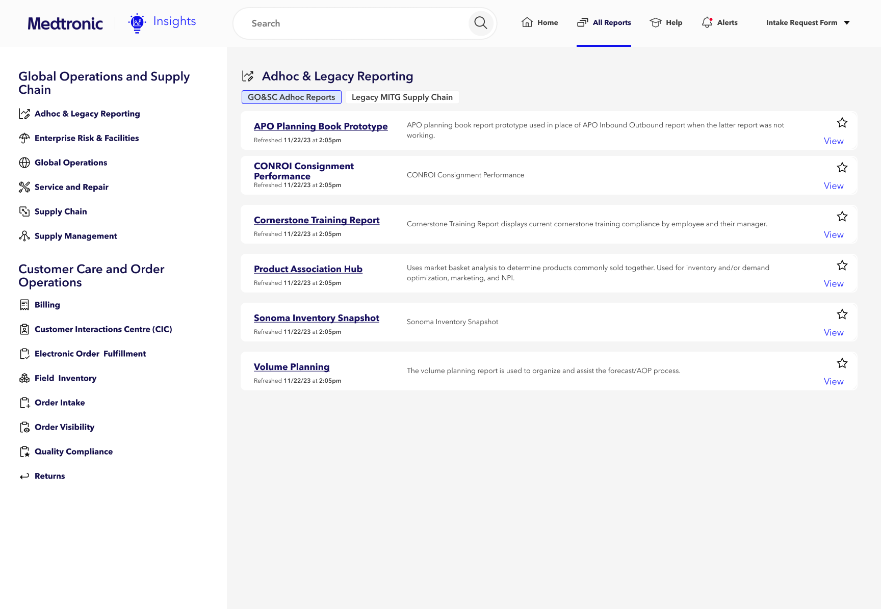
We explored various options to improve the report display and, with stakeholder input, selected one design for user testing. To validate the new design's effectiveness, we asked users to find an unfamiliar report in both the existing pilot app and a clickable prototype. Although we couldn't directly compare the experiences since users searched for different reports, we observed that in the pilot design, two of the four users missed the report initially, while in the new design, all users found the report on the first try. Users also reported that the new design was clearer and easier to navigate.
Final Design for the All Reports Page - we replicated their mental model by adding tabs to give the similar column structure of the old platform but separating it out to make it more digestible and easier to understand for new users.
Outcome
With both the changes to search bar as well as the update to the All reports page we were able to reduce the Exit rate from 80% down to 25% giving Medtronic the confidence to release this to the larger user base.