JL
Work
About
Nobody Wants to Choose a Mover
Senior designer responsible for end-to-end UX and product design across three complete direction changes — from initial user research through to market launch. Visual design and branding handled by a separate designer at Rangle.
Role
Senior Product Designer
Project
Marketplace Design
Company
Movebuddy
The opportunity
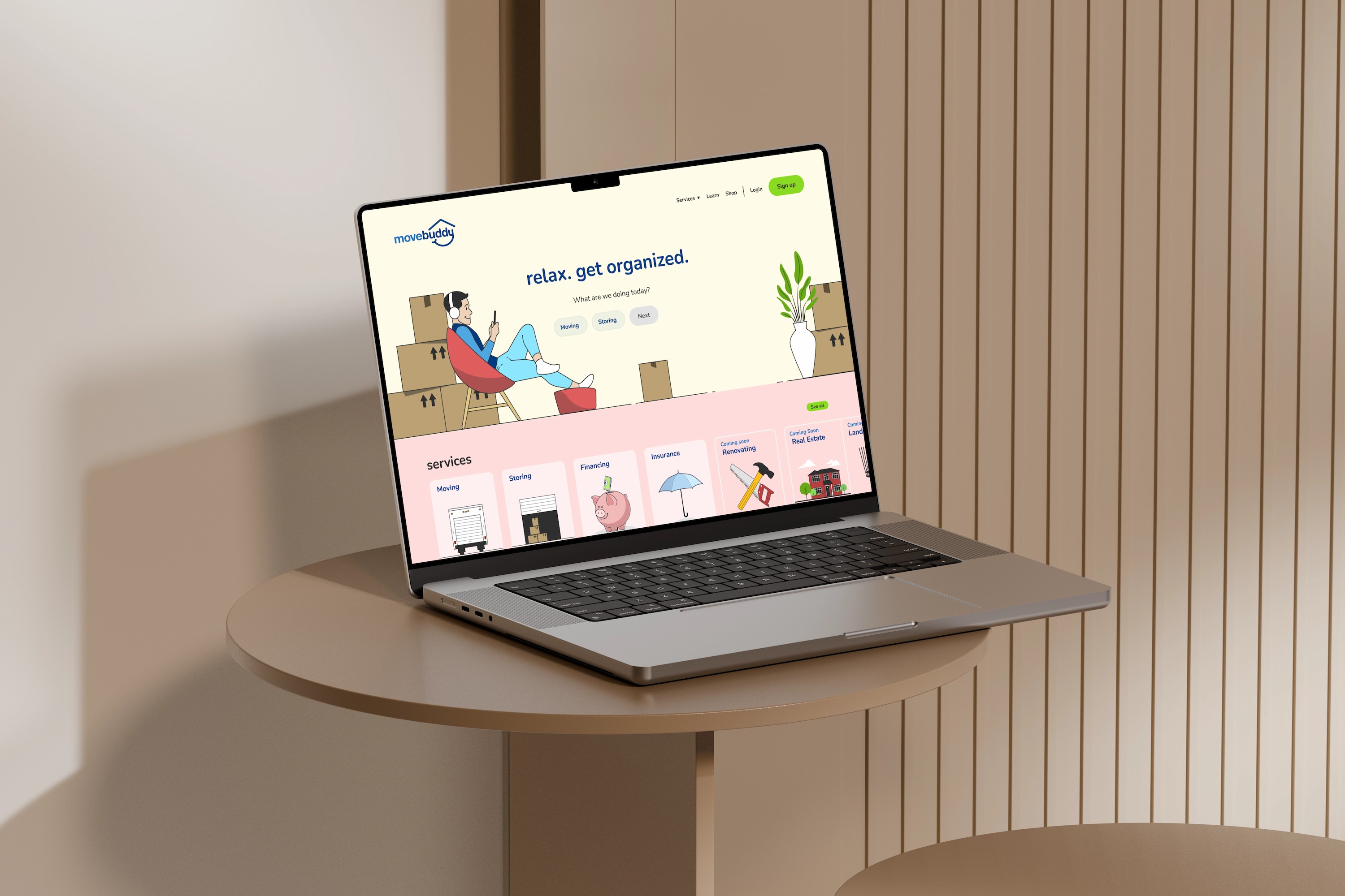
StorageVault, a self and portable storage company, noticed a pattern in their customer data — a significant portion of people needing storage were in the middle of a move or renovation. The connection was obvious once you saw it.
So StorageVault built MoveBuddy — a platform to help people find a mover. The goal was straightforward: find product market fit and see real traction with users booking moves through the platform.
What wasn't straightforward was figuring out what kind of product MoveBuddy actually needed to be.
Understanding the people moving
Before designing anything, we spoke with around 10 potential customers to understand what moving actually felt like from their side. Three things came back consistently:
Getting quotes was exhausting.
Every mover had their own process — online forms, phone calls, text messages. Users had to repeat the same information over and over to get comparable quotes. The effort required before you could even make a decision was significant.
Trust was everything.
Users had heard the horror stories. Movers who damaged furniture. Movers who held belongings hostage demanding more money. Price mattered — but not as much as feeling confident the person showing up at your door was safe to let into your home.
They didn't want the cheapest mover. They wanted the least stressful move.
People in the middle of a move have an enormous amount going on. Every decision they can take off their plate is a relief. The opportunity wasn't just to help them find a mover — it was to reduce the cognitive load of finding one. That last insight would end up reshaping everything.
Approach 1 - The obvious solution
Our first instinct was what most people would build: a marketplace where users fill out their move details and get presented with a list of movers to choose from. Clear pricing upfront. Google reviews for trust signals. Organized by service level.
Clean. Logical. Sensible.
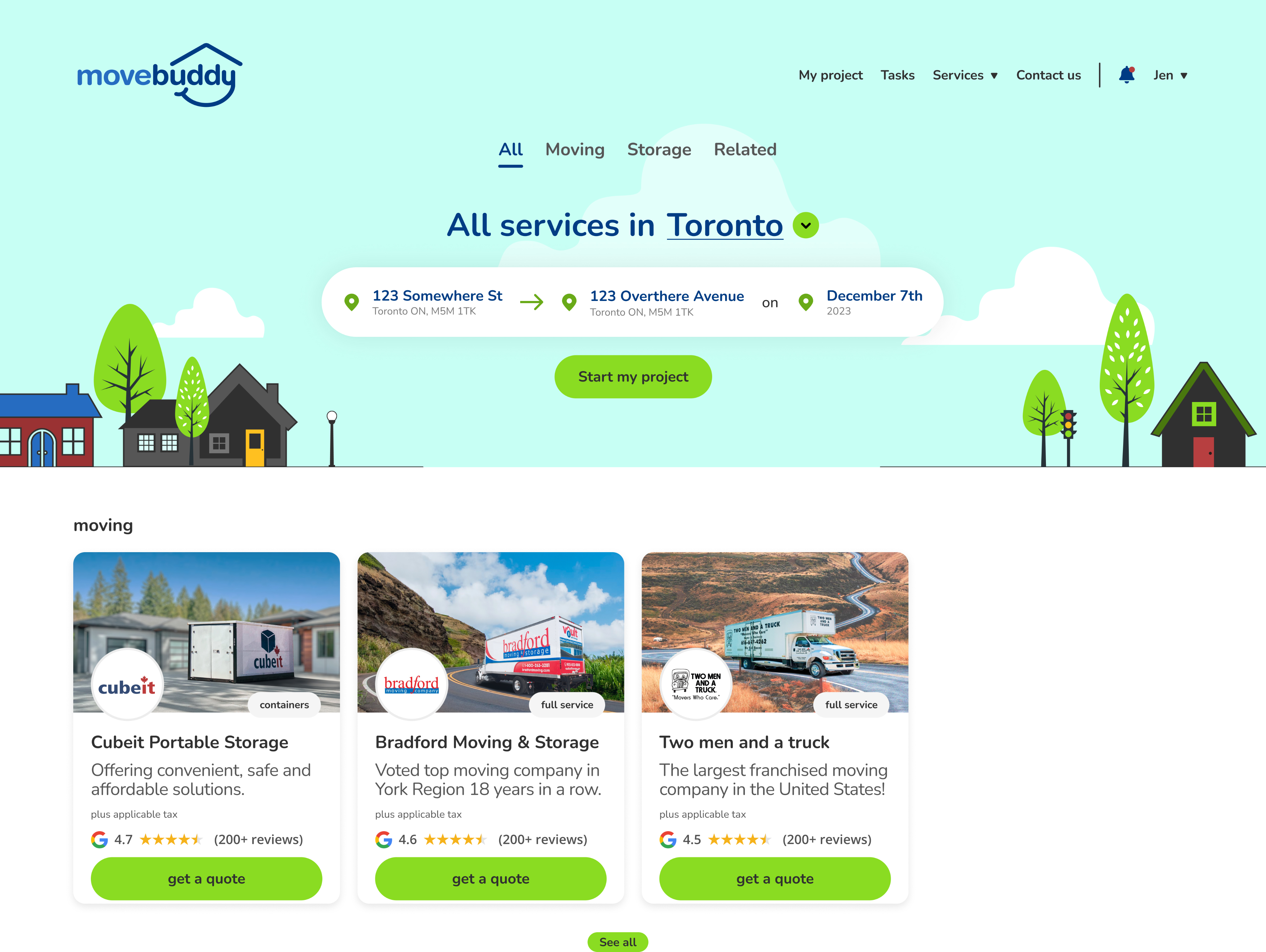
Marketplace with list of movers, pricing, and reviews
We prototyped it and tested it with users. They could navigate it fine. They appreciated seeing pricing upfront. And then one user said something that stopped us:
"Are these movers bidding on my job?"
— User testing participant
We probed deeper. What she was really telling us was that even with pricing visible and reviews present, she was now faced with a new problem — comparing movers and making a decision. We had reduced the effort of getting quotes. We hadn't reduced the mental load of choosing.We hadn't reduced the mental load of choosing. We'd just moved it.
The moment we stopped and looked around
Before jumping to a second approach, we studied the competitive landscape — and realized our first approach wasn't just imperfect. It was indistinguishable from every other moving marketplace already in the market. They all offered aggregation. They all offered comparison. They all put the decision back on the user.
We went looking for a different frame entirely and found it in a16z's framework on marketplace evolution — specifically the distinction between unbundled marketplaces and managed marketplaces.
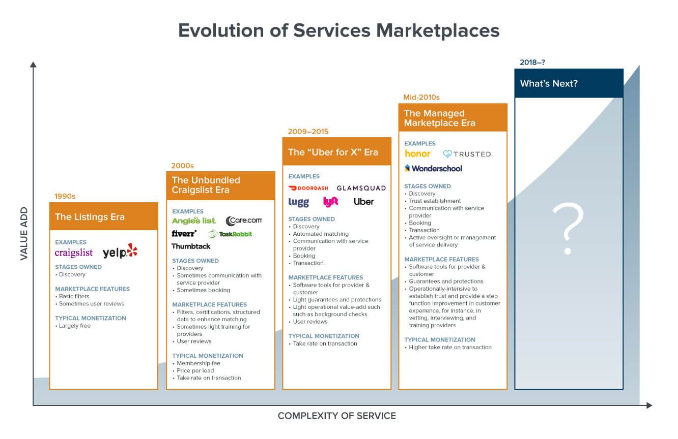
a16z framework on marketplaces
We built what everyone did and put the onus on the user.
Approach 2 - Narrowing the choice
If the problem was decision fatigue, the first response was to reduce the number of options. Instead of showing every available mover, we'd show three — curated, vetted, matched to the user's specific needs.
But narrowing choices introduced a new risk: if we're limiting what users see, they need to trust that we're making good choices on their behalf.
To address this, we worked with MoveBuddy to develop a guarantee — a commitment to vet every mover on the platform and provide recourse if something went wrong. The guarantee wasn't just a product feature. It was the foundation of trust that made a curated approach viable.
Curated three mover options with guarantee badge
Approach 3 - Taking away the decision
The insight from our research had been sitting there the whole time: users didn't want to choose a mover. They wanted someone to choose for them.
So we stopped asking them to choose.
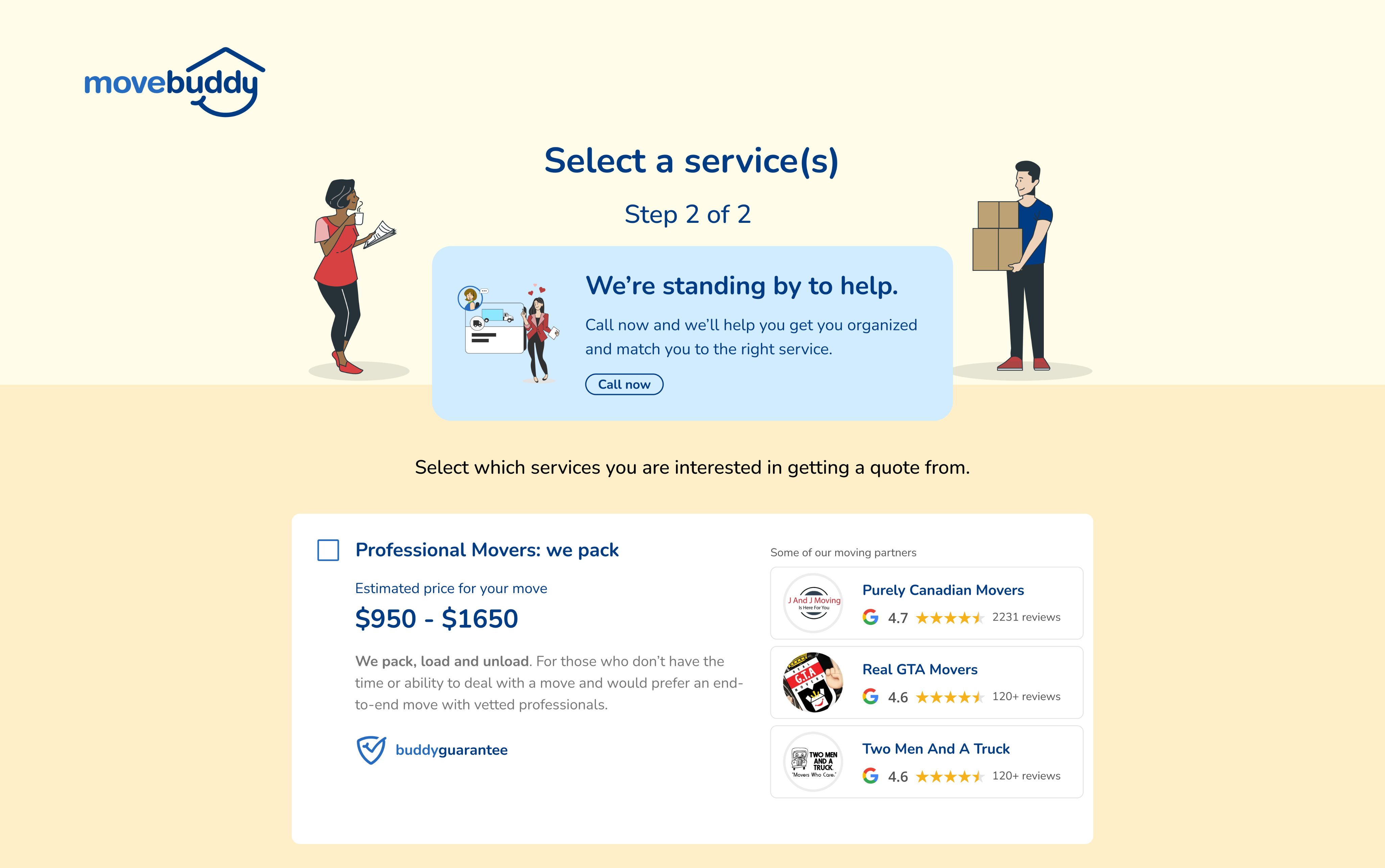
In our third approach, MoveBuddy finds the mover. The user selects a service level — the type of move they need — and MoveBuddy matches them with the right mover and presents a quote. The user's only decision is whether to accept.
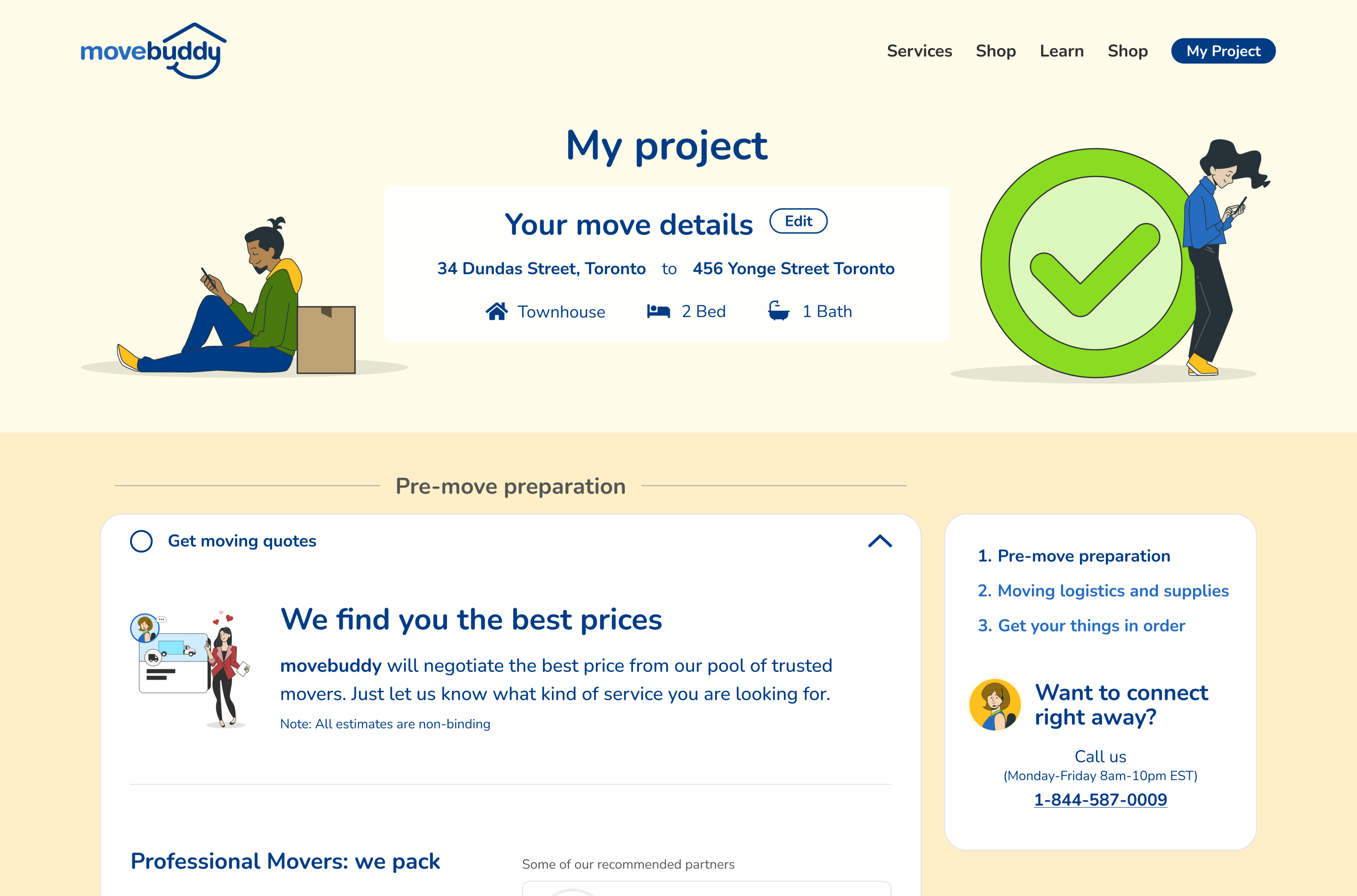
Service level selection with MoveBuddy match
Like Uber you don't browse drivers and pick one. You select your service level and a driver is assigned. We applied the same logic to moving.
The guarantee we'd built in Approach 2 became even more critical here. It wasn't just a trust signal anymore — it was the safety net that made the entire model work.
What the market told us
After three months on the market, the answer was yes.
12.5% average funnel completion rate within three months of launch
For a new marketplace product in a category where trust is the primary barrier, 12.5% funnel completion is meaningful traction. Users were not just browsing — they were committing to a mover they hadn't chosen themselves, from a platform they'd just discovered.
The managed marketplace model worked because it addressed the actual problem — not the stated one. Users said they wanted better ways to find and compare movers. What they actually needed was to not have to compare movers at all.

Reflection
The most important decision on this project wasn't a design decision. It was the decision to stop and question whether we were building the right thing before refining how we were building it.
Our first approach was functional. It was testable. We could have shipped it and called it done. But something one user said in testing opened a door we couldn't close.
She wasn't asking about the interface. She was telling us the product was still asking too much of her.
The best marketplace doesn't give users more choices. It gives them fewer decisions. We didn't design a better mover comparison tool — we designed a product that made comparison unnecessary.
That distinction is what drove the outcome.

Joshua Lee
Work
About
Nobody Wants to Choose a Mover
Senior designer responsible for end-to-end UX and product design across three complete direction changes — from initial user research through to market launch. Visual design and branding handled by a separate designer at Rangle.
Role
Senior Product Designer
Project
Marketplace Design
Company
Movebuddy
The opportunity
StorageVault, a self and portable storage company, noticed a pattern in their customer data — a significant portion of people needing storage were in the middle of a move or renovation. The connection was obvious once you saw it.
So StorageVault built MoveBuddy — a platform to help people find a mover. The goal was straightforward: find product market fit and see real traction with users booking moves through the platform.
What wasn't straightforward was figuring out what kind of product MoveBuddy actually needed to be.
Understanding the people moving
Before designing anything, we spoke with around 10 potential customers to understand what moving actually felt like from their side. Three things came back consistently:
Getting quotes was exhausting.
Every mover had their own process — online forms, phone calls, text messages. Users had to repeat the same information over and over to get comparable quotes. The effort required before you could even make a decision was significant.
Trust was everything.
Users had heard the horror stories. Movers who damaged furniture. Movers who held belongings hostage demanding more money. Price mattered — but not as much as feeling confident the person showing up at your door was safe to let into your home.
They didn't want the cheapest mover. They wanted the least stressful move.
People in the middle of a move have an enormous amount going on. Every decision they can take off their plate is a relief. The opportunity wasn't just to help them find a mover — it was to reduce the cognitive load of finding one. That last insight would end up reshaping everything.
Approach 1 - The obvious solution
Our first instinct was what most people would build: a marketplace where users fill out their move details and get presented with a list of movers to choose from. Clear pricing upfront. Google reviews for trust signals. Organized by service level.
Clean. Logical. Sensible.
Marketplace with list of movers, pricing, and reviews
We prototyped it and tested it with users. They could navigate it fine. They appreciated seeing pricing upfront. And then one user said something that stopped us:
"Are these movers bidding on my job?"
— User testing participant
We probed deeper. What she was really telling us was that even with pricing visible and reviews present, she was now faced with a new problem — comparing movers and making a decision. We had reduced the effort of getting quotes. We hadn't reduced the mental load of choosing.We hadn't reduced the mental load of choosing. We'd just moved it.
The moment we stopped and looked around
Before jumping to a second approach, we studied the competitive landscape — and realized our first approach wasn't just imperfect. It was indistinguishable from every other moving marketplace already in the market. They all offered aggregation. They all offered comparison. They all put the decision back on the user.
We went looking for a different frame entirely and found it in a16z's framework on marketplace evolution — specifically the distinction between unbundled marketplaces and managed marketplaces.
a16z framework on marketplaces
We built what everyone did and put the onus on the user.
Approach 2 - Narrowing the choice
If the problem was decision fatigue, the first response was to reduce the number of options. Instead of showing every available mover, we'd show three — curated, vetted, matched to the user's specific needs.
But narrowing choices introduced a new risk: if we're limiting what users see, they need to trust that we're making good choices on their behalf.
To address this, we worked with MoveBuddy to develop a guarantee — a commitment to vet every mover on the platform and provide recourse if something went wrong. The guarantee wasn't just a product feature. It was the foundation of trust that made a curated approach viable.
Curated three mover options with guarantee badge
Approach 3 - Taking away the decision
The insight from our research had been sitting there the whole time: users didn't want to choose a mover. They wanted someone to choose for them.
So we stopped asking them to choose.
In our third approach, MoveBuddy finds the mover. The user selects a service level — the type of move they need — and MoveBuddy matches them with the right mover and presents a quote. The user's only decision is whether to accept.
Service level selection with MoveBuddy match
Like Uber you don't browse drivers and pick one. You select your service level and a driver is assigned. We applied the same logic to moving.
The guarantee we'd built in Approach 2 became even more critical here. It wasn't just a trust signal anymore — it was the safety net that made the entire model work.
What the market told us
After three months on the market, the answer was yes.
12.5% average funnel completion rate within three months of launch
For a new marketplace product in a category where trust is the primary barrier, 12.5% funnel completion is meaningful traction. Users were not just browsing — they were committing to a mover they hadn't chosen themselves, from a platform they'd just discovered.
The managed marketplace model worked because it addressed the actual problem — not the stated one. Users said they wanted better ways to find and compare movers. What they actually needed was to not have to compare movers at all.

Reflection
The most important decision on this project wasn't a design decision. It was the decision to stop and question whether we were building the right thing before refining how we were building it.
Our first approach was functional. It was testable. We could have shipped it and called it done. But something one user said in testing opened a door we couldn't close.
She wasn't asking about the interface. She was telling us the product was still asking too much of her.
The best marketplace doesn't give users more choices. It gives them fewer decisions. We didn't design a better mover comparison tool — we designed a product that made comparison unnecessary.
That distinction is what drove the outcome.

Joshua Lee
Work
About
Nobody Wants to Choose a Mover
Senior designer responsible for end-to-end UX and product design across three complete direction changes — from initial user research through to market launch. Visual design and branding handled by a separate designer at Rangle.
Role
Senior Product Designer
Project
Marketplace Design
Company
Movebuddy
The opportunity
StorageVault, a self and portable storage company, noticed a pattern in their customer data — a significant portion of people needing storage were in the middle of a move or renovation. The connection was obvious once you saw it.
So StorageVault built MoveBuddy — a platform to help people find a mover. The goal was straightforward: find product market fit and see real traction with users booking moves through the platform.
What wasn't straightforward was figuring out what kind of product MoveBuddy actually needed to be.
Understanding the people moving
Before designing anything, we spoke with around 10 potential customers to understand what moving actually felt like from their side. Three things came back consistently:
Getting quotes was exhausting.
Every mover had their own process — online forms, phone calls, text messages. Users had to repeat the same information over and over to get comparable quotes. The effort required before you could even make a decision was significant.
Trust was everything.
Users had heard the horror stories. Movers who damaged furniture. Movers who held belongings hostage demanding more money. Price mattered — but not as much as feeling confident the person showing up at your door was safe to let into your home.
They didn't want the cheapest mover. They wanted the least stressful move.
People in the middle of a move have an enormous amount going on. Every decision they can take off their plate is a relief. The opportunity wasn't just to help them find a mover — it was to reduce the cognitive load of finding one. That last insight would end up reshaping everything.
Approach 1 - The obvious solution
Our first instinct was what most people would build: a marketplace where users fill out their move details and get presented with a list of movers to choose from. Clear pricing upfront. Google reviews for trust signals. Organized by service level.
Clean. Logical. Sensible.
Marketplace with list of movers, pricing, and reviews
We prototyped it and tested it with users. They could navigate it fine. They appreciated seeing pricing upfront. And then one user said something that stopped us:
"Are these movers bidding on my job?"
— User testing participant
We probed deeper. What she was really telling us was that even with pricing visible and reviews present, she was now faced with a new problem — comparing movers and making a decision. We had reduced the effort of getting quotes. We hadn't reduced the mental load of choosing.We hadn't reduced the mental load of choosing. We'd just moved it.
The moment we stopped and looked around
Before jumping to a second approach, we studied the competitive landscape — and realized our first approach wasn't just imperfect. It was indistinguishable from every other moving marketplace already in the market. They all offered aggregation. They all offered comparison. They all put the decision back on the user.
We went looking for a different frame entirely and found it in a16z's framework on marketplace evolution — specifically the distinction between unbundled marketplaces and managed marketplaces.
a16z framework on marketplaces
We built what everyone did and put the onus on the user.
Approach 2 - Narrowing the choice
If the problem was decision fatigue, the first response was to reduce the number of options. Instead of showing every available mover, we'd show three — curated, vetted, matched to the user's specific needs.
But narrowing choices introduced a new risk: if we're limiting what users see, they need to trust that we're making good choices on their behalf.
To address this, we worked with MoveBuddy to develop a guarantee — a commitment to vet every mover on the platform and provide recourse if something went wrong. The guarantee wasn't just a product feature. It was the foundation of trust that made a curated approach viable.
Curated three mover options with guarantee badge
Approach 3 - Taking away the decision
The insight from our research had been sitting there the whole time: users didn't want to choose a mover. They wanted someone to choose for them.
So we stopped asking them to choose.
In our third approach, MoveBuddy finds the mover. The user selects a service level — the type of move they need — and MoveBuddy matches them with the right mover and presents a quote. The user's only decision is whether to accept.
Service level selection with MoveBuddy match
Like Uber you don't browse drivers and pick one. You select your service level and a driver is assigned. We applied the same logic to moving.
The guarantee we'd built in Approach 2 became even more critical here. It wasn't just a trust signal anymore — it was the safety net that made the entire model work.
What the market told us
After three months on the market, the answer was yes.
12.5% average funnel completion rate within three months of launch
For a new marketplace product in a category where trust is the primary barrier, 12.5% funnel completion is meaningful traction. Users were not just browsing — they were committing to a mover they hadn't chosen themselves, from a platform they'd just discovered.
The managed marketplace model worked because it addressed the actual problem — not the stated one. Users said they wanted better ways to find and compare movers. What they actually needed was to not have to compare movers at all.

Reflection
The most important decision on this project wasn't a design decision. It was the decision to stop and question whether we were building the right thing before refining how we were building it.
Our first approach was functional. It was testable. We could have shipped it and called it done. But something one user said in testing opened a door we couldn't close.
She wasn't asking about the interface. She was telling us the product was still asking too much of her.
The best marketplace doesn't give users more choices. It gives them fewer decisions. We didn't design a better mover comparison tool — we designed a product that made comparison unnecessary.
That distinction is what drove the outcome.
